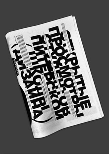
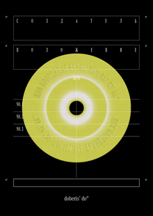
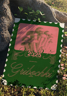
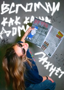
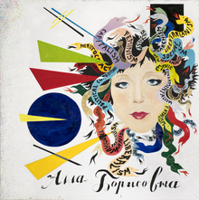
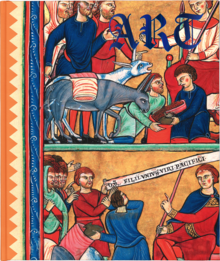
Typographical suite: portrait, still life, and landscape compositions created using appliqué and digital collage techniques. Experimental lettering. Design of newspaper strips measuring 420×578 mm based on news from the Design School.
№ 1 TYPOGRAPHIC COLLAGES
The basis for this collage is a Soviet still life by Anatoly Shumilkin. I was drawn to its unconventional perspective, and I decided to experiment with it in my work.
To create the digital collage and emphasize the Soviet aesthetic, I used the NATASHA font. The effect of contrast and volume in the piece is achieved through the repetition of text.

Soviet still life by Anatoly Shumilkin
Model in the portrait of Petrova Sofia
A dramatic contrast—large typography and deep black—became the key element of the portrait. The heroine’s hair smoothly flows into an infinite cascade of letters.
In the digital collage, I utilized the BEBAS typeface and the metaphor of a vertical barbershop business card, limiting myself to just two words. Everything else was rendered in numbers and symbols.
Chernihov’s Architectural Fantasies Landscape
I use large type not only in portraiture but also in architectural applied collages. The thickness of the overlay and the building’s background layer also appear.
In the digital collage, I actively use text about the Overhead Crane Workshop, playing with various typefaces, horizontal and vertical lines, as well as very small lettering. The antique typeface used is NWT Bodoni.
No. 2 EXPERIMENTAL LETTERING
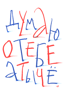
In letter design, my letters came alive, gaining their own personalities and expressive character.
Latin alphabet, letters, and symbols
A blend of archaic Neanderthal-era motifs and cutting-edge nanotechnology—that is the defining characteristic of this experimental typeface. I believe it is perfectly suited for the 'Cave' brand—a museum dedicated to Neanderthals.
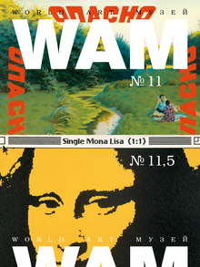
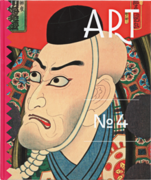
HSE Art and Design School News Gazette No. 3
Fonts: Rene Regular, OT-Build-Monoline-900, Helvetica Regular, Helvetica Italic, Helvetica Bold
For newspaper design, I employed a compositional technique where all elements are placed along the edges of the page, creating a sense of openness and drawing focus to the partially blank white space. Additionally, a bold OT Cyrillic typeface was developed.
#canonixus70
Let’s experiment with Mitya Harshak and Vanya Vorontsov!