concept
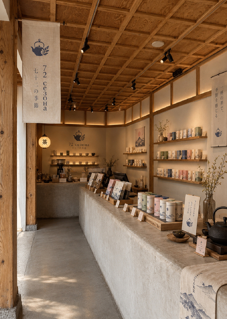
«72 Season» is a Japanese tea brand rooted in the philosophy of human harmony with nature, conscious consumption, and attention to the subtlest shifts in the world around us.
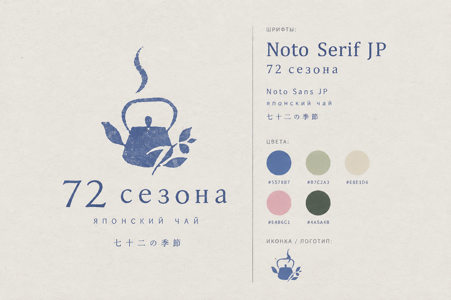
prompt: Create a minimalist brand identity presentation for a Japanese-inspired tea brand called «72 Seasons, ” based on the traditional Japanese calendar, which divides the year into 72 micro-seasons.
Design a simple, elegant, and recognizable logo that combines the silhouette of a traditional Japanese teapot with delicate botanical elements, such as tea leaves or small branches. The logo should appear as an authentic brand mark, not merely a decorative illustration.
Employ a calm Japanese aesthetic, drawing inspiration from traditional tea culture, nature, the changing seasons, and vintage Japanese printmaking. The visual style should resemble a subtle linocut or screen-printed illustration with slightly grainy, textured edges.
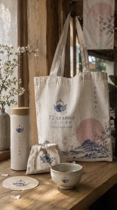
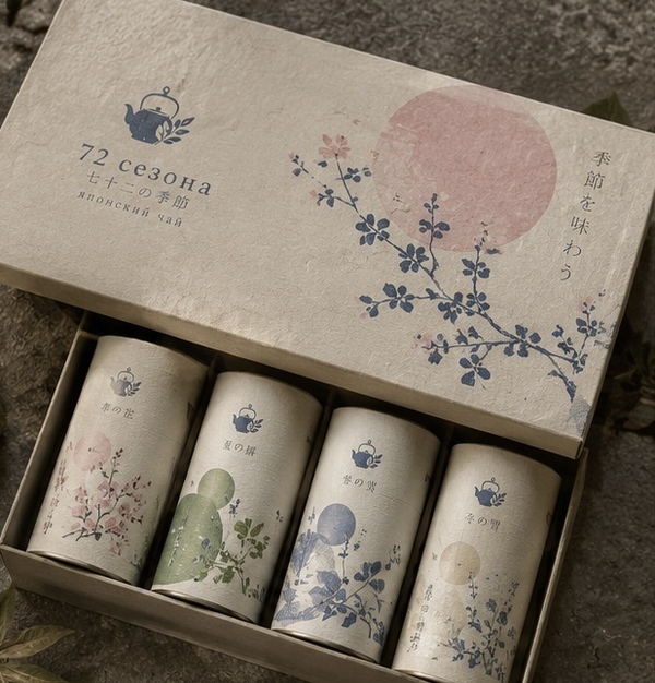
prompt: Create a beautiful, cohesive product mockup presentation for a Japanese-inspired tea brand called «72 Seasons.» Show three branded products together in one composition: elegant tea packaging boxes featuring botanical illustrations, a small desk calendar inspired by the 72 Japanese micro-seasons, and ceramic tea storage jars decorated with delicate seasonal patterns.
Use the brand’s established visual identity, including its minimalist logo, elegant typography, botanical illustrations, muted indigo blue, sage green, warm ivory, dusty pink, and natural earthy tones. The products should look realistic, refined, and commercially appealing, maintaining a consistent Japanese aesthetic. Clean composition, soft lighting, no additional objects or unrelated elements.
Keywords
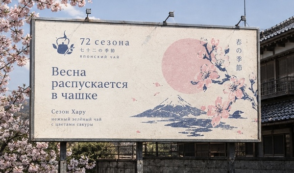
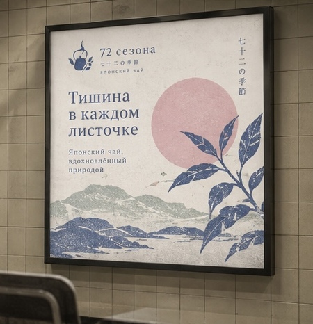
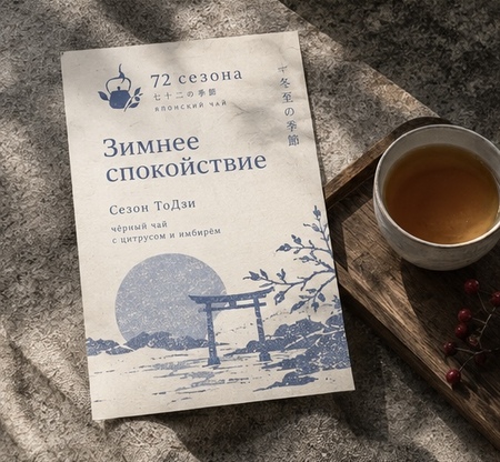
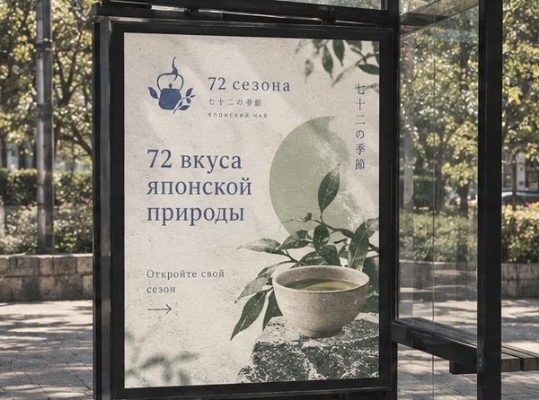
Prompt: Create a high-quality collage of five cohesive key visuals for «Season 72, ” a Japanese tea brand inspired by Japan’s 72 microseasons, where every subtle change in nature represents a unique tea flavor. Use the attached brand identity as the main reference, preserving its original teapot logo, typography (Noto Serif JP and Noto Sans JP), textured paper aesthetic, and color palette: muted indigo, sage green, warm ivory, dusty pink, and deep forest green.
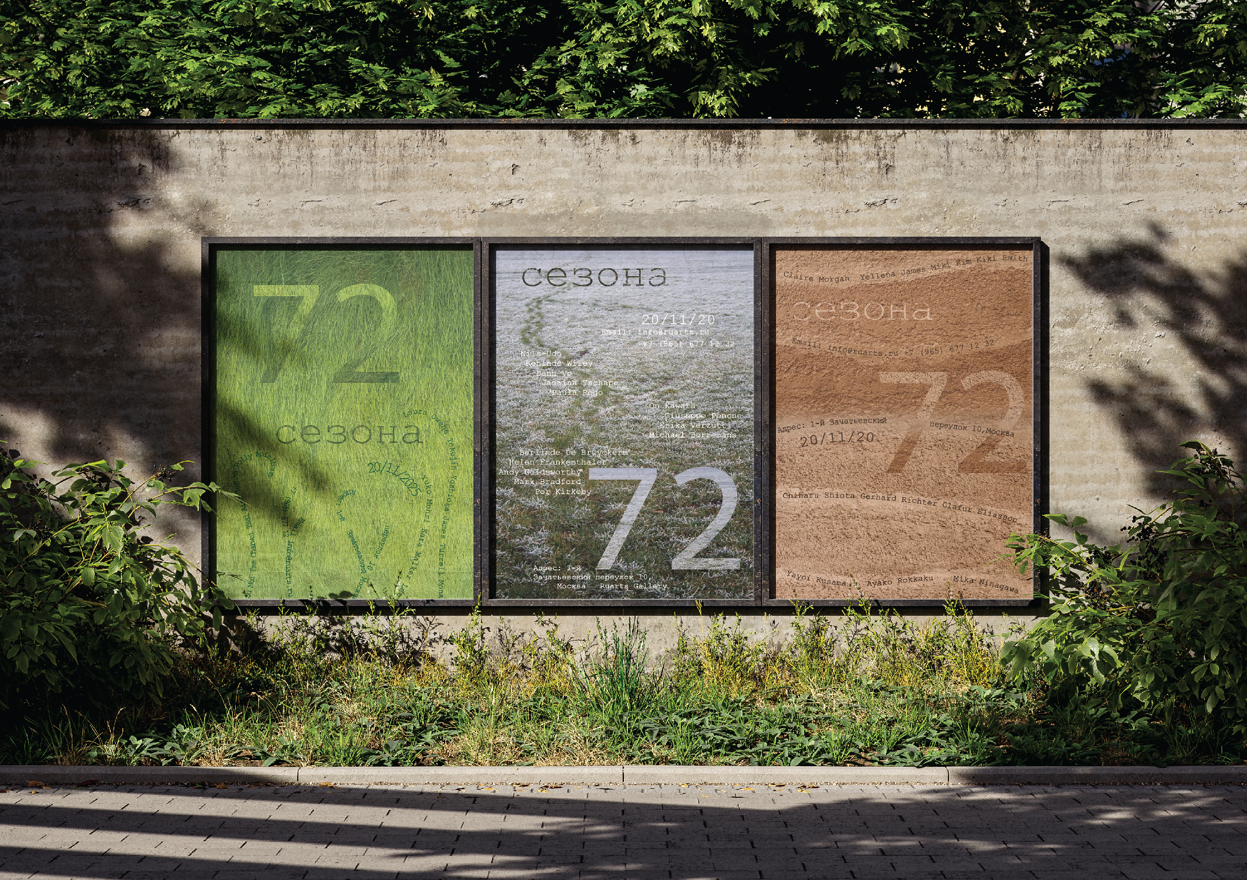
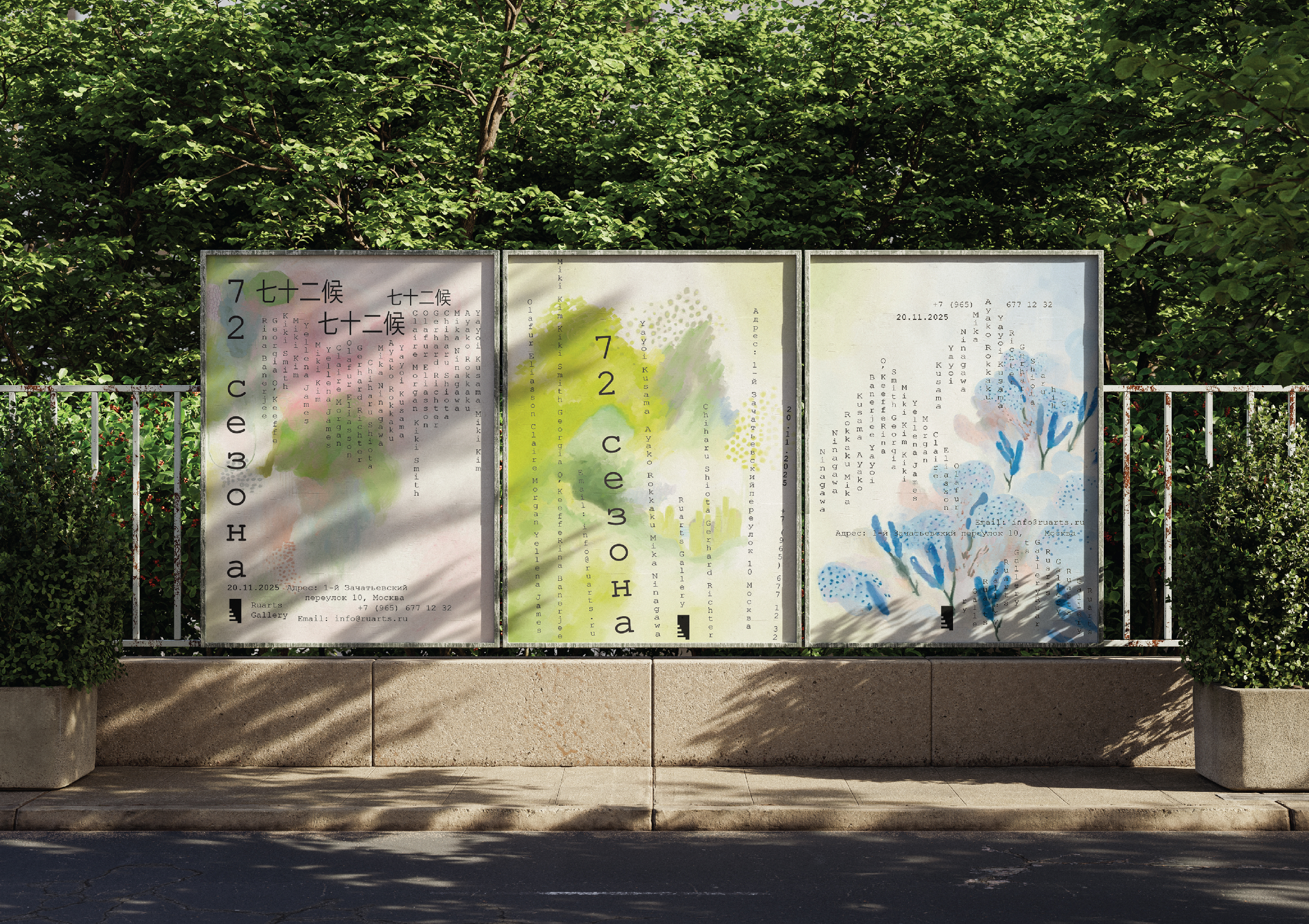
Show five different advertising applications: a large outdoor billboard, a Japanese-style fabric banner, a minimalist sidewalk A-board, a bus stop advertisement, and an illuminated storefront sign. Each composition should be unique but share one recognizable visual language—Japanese woodblock-inspired botanical illustrations, seasonal nature motifs, organic shapes, and poetic Russian headlines. Keep the atmosphere calm, authentic, sophisticated, and slightly nostalgic. All five mockups must look photorealistic, aesthetically unified, and professionally designed, with clearly readable, correctly spelled Russian text.
Space