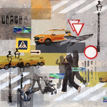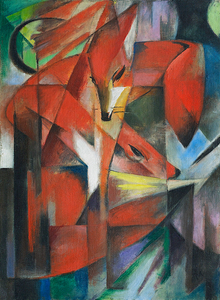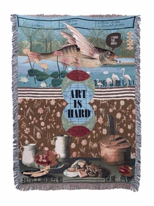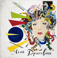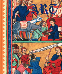
Present the history of burnout syndrome in the style of dark fantasy, using symbols of mystery and metaphor alongside original illustrations.
Longform Role and Structure: The longform is divided into 4 main chapters.
Role and Structure of the Long Read: The long read is divided into 4 main chapters Chapter 1: What is burnout—understanding the burnout syndrome Chapter 2: Causes of burnout—work overload, unsupportive environment, and perfectionism Chapter 3: Impact on physical, mental, and social well-being Chapter 4: The path to recovery, healing, and rediscovering self-love
The Design Process and Visual Storytelling
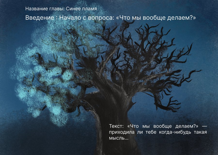
Introduction and Hook A compelling question: «What are we even doing?»
The beginning of the emotional journey: it conveys a deep internal weariness, a slowly eroding apathy, and an endless, repetitive burden that drains all vitality.
2.1 Storyboard Narrative Sequence
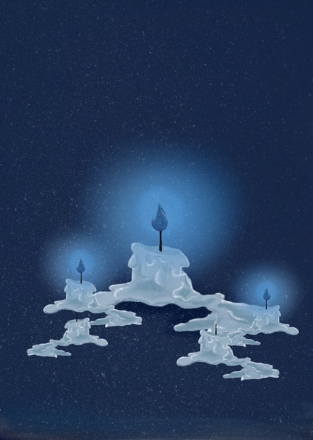
Chapter 1. What is burnout: Comparing it to the «blue flame"—scientifically, it burns most intensely, but most people perceive the orange flame as hotter because they are accustomed to seeing it that way. This is a metaphor for those who continue to function perfectly on the outside but are completely burned out on the inside; the body activates a defense mechanism—characterized by detachment and withdrawal from the world.
Chapter 2. Causes of Burnout: It opens with the symbol of a «mask» inscribed with «Fine”—a reflection of the habit of denying one’s needs while pretending everything is okay. The true causes are then explored: unmanageable workload, an unsupportive environment, and perfectionism that compels self-blame for the slightest error.
Chapter 3. Consequences—The Climax: The climax of the story illustrates its impact on all levels of life: physical (headaches, insomnia), emotional (loss of the ability to find joy in small things), and social (isolation and gradual detachment from others).
Chapter 4. Recovery and Self-Care: A Conclusion Dedicated to Healing. The path leads through self-acceptance, permission to truly rest, digital detoxification, reconnecting with and reclaiming your inner child, and establishing personal boundaries for self-protection.
Typography and chosen color palette
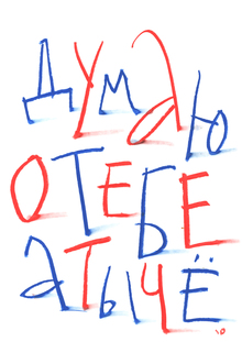
Headline Font
Visual Style A display font in a dark fantasy and gothic style. The lines are slightly uneven, featuring a hand-drawn texture—conveying imperfection, mystery, and depth.Emotional Content
- Fairytale and Fantasy Atmosphere The letterforms resemble pages from a gothic or dark fairytale book. They immediately draw the eye and set the mood from the first glance.
- Thematic Resonance The curved, irregular lines evoke dry branches or tongues of flame—echoing the image of «blue flames» and the immersion into the world of experiences during burnout.
Illustration Sketches
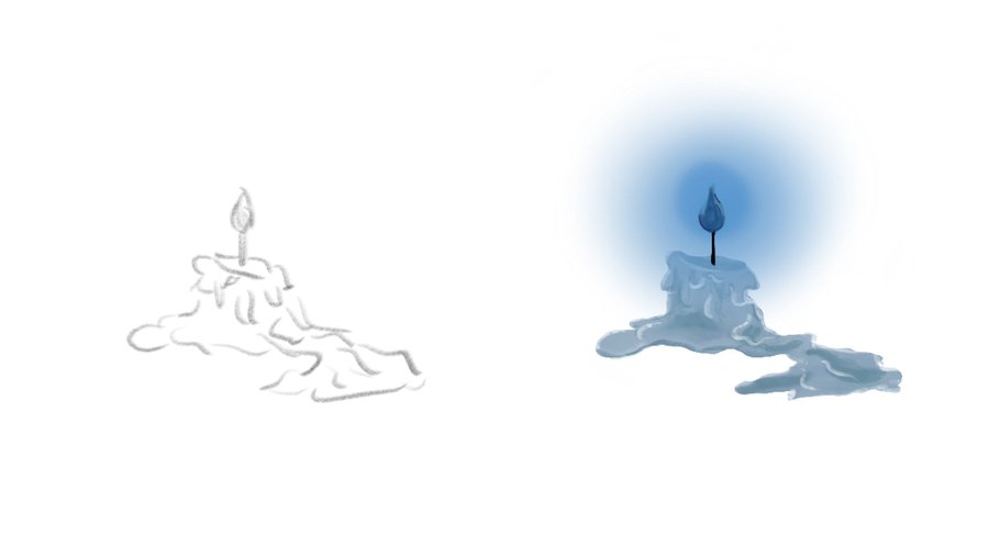
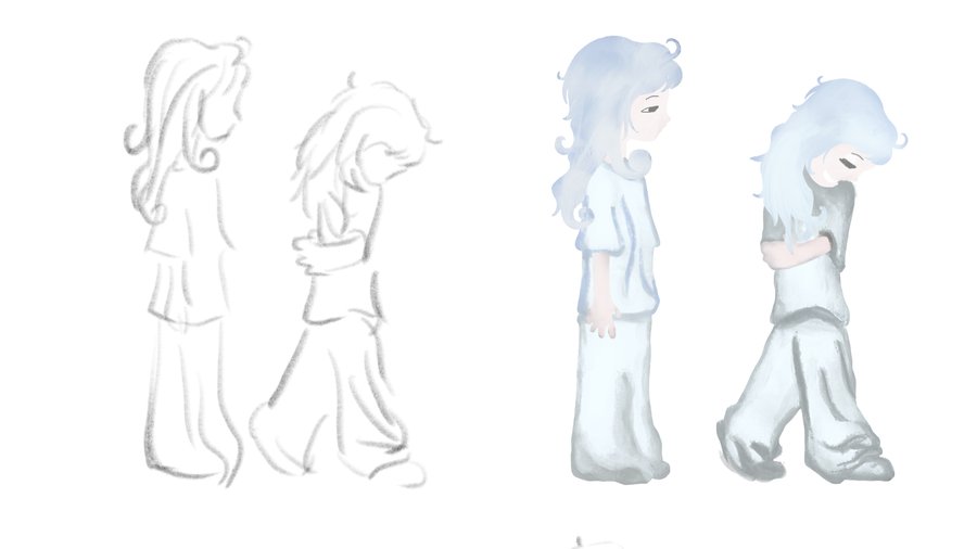
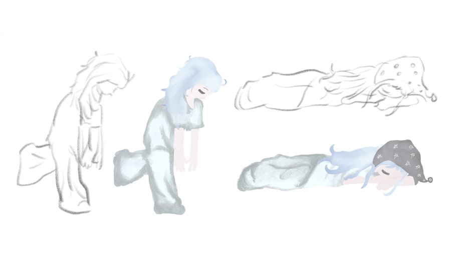
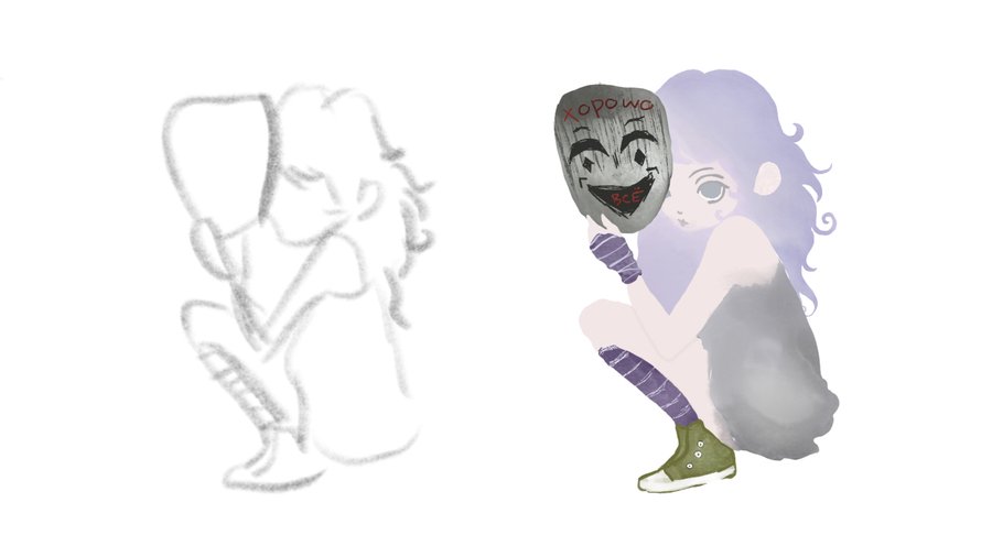
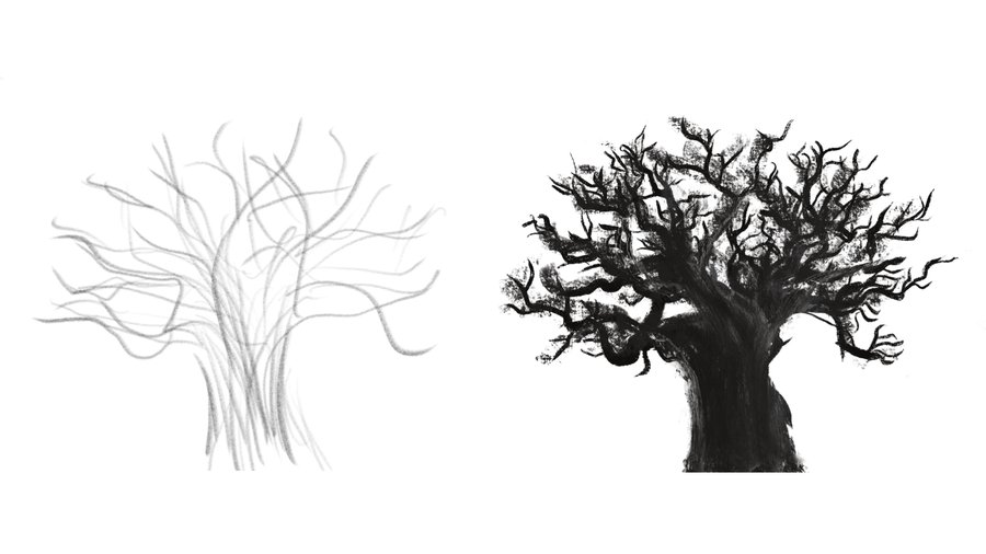
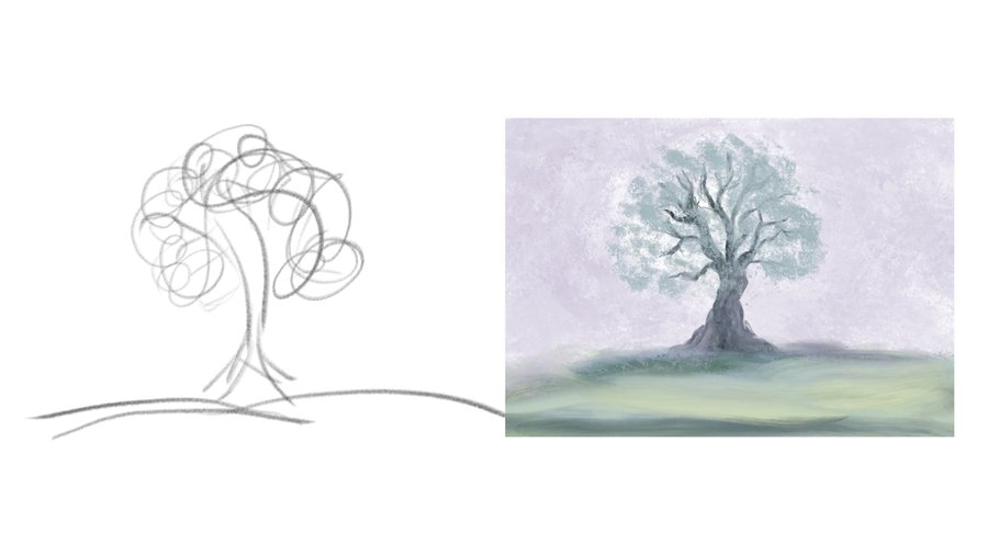
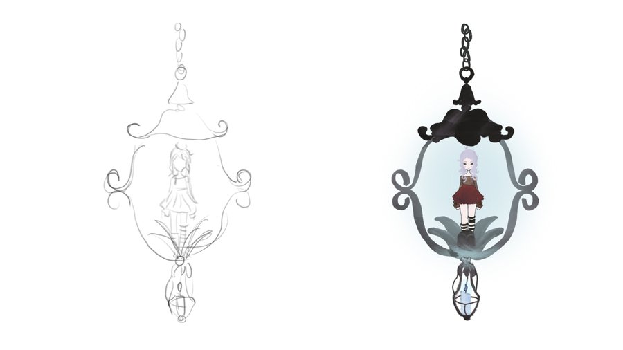
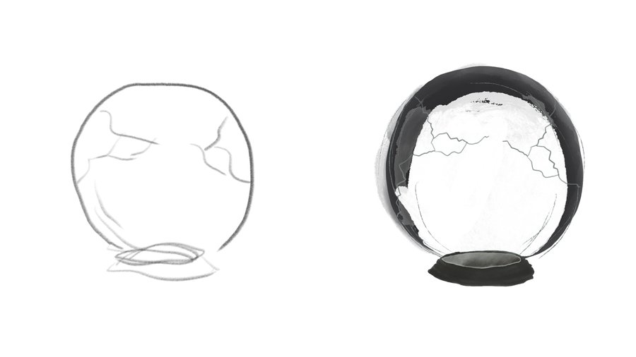
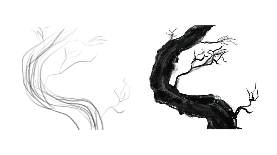
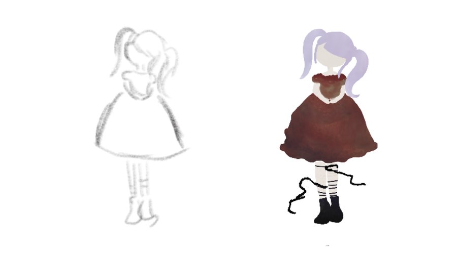
The primary font used throughout the entire work
The main text uses a classic serif font—one that is easy to read, balanced, and creates a comfortable visual experience while reading.
Color Palette and Mood
Chapters 1–3: Dark blue and black paletteBlue — coolness, melancholy, stillness, loneliness. Reflects internal detachment during burnout. Black — heaviness, despair.Chapter 4: Primary colorsLight blue — tranquility, safety, ease of breathing, the gentle beginning of recovery. White — space, release from burden, purity, a new beginning, and self-care. Accents: muted pastel tonesPastel / pink / light yellow — small, vibrant touches. They symbolize the return of joy, mindfulness, and small pleasures in life—gradually, one step at a time.
The Logic of Color NarrativeThe transition from dark blue to light blue and white creates an emotional contrast—a journey from darkness to light, representing liberation and healing. The awakening colors do not flare up instantly—healing is a gradual, step-by-step process.