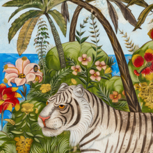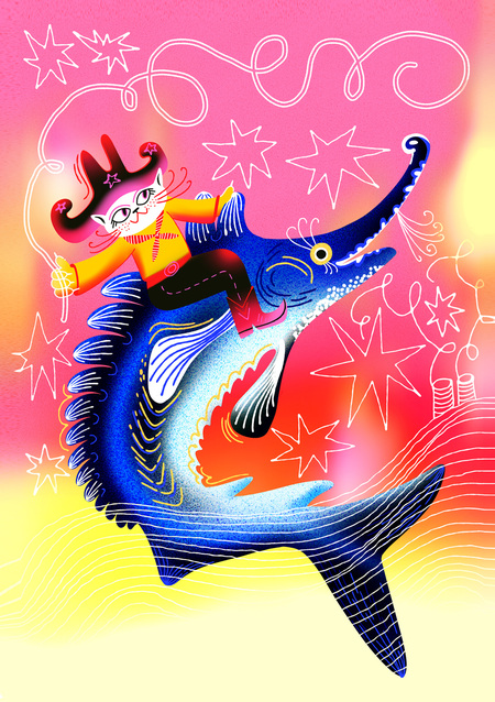
The Udomli tourist identity is built around the image of the beluga—a large, memorable, and charming symbol of the city :)
Udomli is a territory with high tourism potential, but it is currently in the process of developing a cohesive product.
What currently exists:
- Participation in Rosatom’s pilot and accelerator programs.
- A strong foundation for industrial tourism: the Kaliningrad NPP.
- Natural resources: lakes, recreational areas, and ecotourism potential.
- Cultural and historical sites: museums, estates, and locations associated with artists and musicians.
- Local initiatives: souvenir products, craft projects, and gastronomic and farm-to-table formats.
The issue is not a lack of tourism potential, but rather its fragmentation. The natural, cultural, and urban assets of Udomli have not yet coalesced into a unified route or a recognizable tourism brand.
The project’s objective is to transform Udomli’s tourism potential into a cohesive experience system. The project integrates routes, navigation, city landmarks, merchandise, and visual identity into a unified narrative for discovering the city.
The concept addresses the problem of fragmented tourist sites: different routes are tailored to various target audiences and help reveal the city through its nature, culture, local stories, and innovative leisure formats.

City Logo and Signage System
The city logo is based on the image of a fish—one of Udmurtia’s key symbols, linked to nature and fishing tourism. The sign’s shape is built upon the motif of scales, while the grotesque lettering of the typographic element gives the logo a modern, concise, and highly legible appearance in the urban environment.
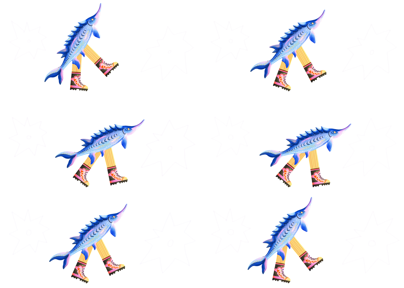
An additional graphic element—a silhouette of a swimming fish—has been developed. It extends the concept of the logo and can function as a standalone symbol in navigation, merchandise, and urban graphics, thereby strengthening brand recognition.
The four scales on the fish’s body represent a conceptual module of the identity: each denotes one of the route directions and one facet of the city’s identity—hiking tourism, art, science, and fishing.
city coat of arms and tourist logo
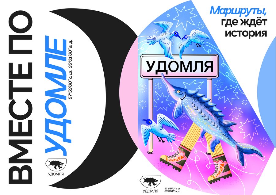
Posters
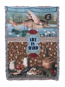
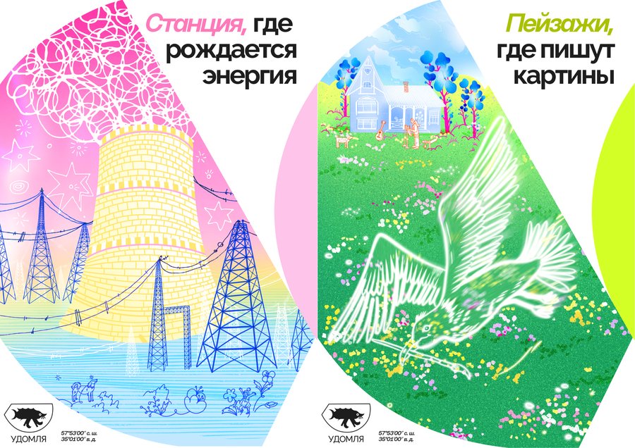
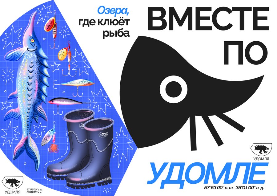
Posters develop the scaled graphic module established in the logo. The scale becomes not just a decorative element, but the primary compositional form: within it are placed illustrations, color accents, and narrative details for each discipline.
This allows the series to be unified by a single visual principle, while each poster retains its distinct character.
Thanks to the modular principle, the poster series remains flexible: elements can be arranged in various orders and combined in any quantity.
Guide and Routes
Five tourist routes have been developed for Udmule, tailored to different target audiences. Each route reveals the city from a new perspective and offers a unique scenario for exploring its nature, culture, history, and local identity.
The brochure folds from A3 paper to A6 format.
Before starting the walk, you can take a special foldable booklet along with the map. Guests will collect stamps throughout the route, and at the end, they will exchange them for a small souvenir.
General Route: «Getting to Know Udmeya»
This route connects the city’s key points and serves as a foundational itinerary for a first introduction to Udmeya. It passes through the main public spaces, cultural landmarks, and the embankment, forming a holistic view of the city.
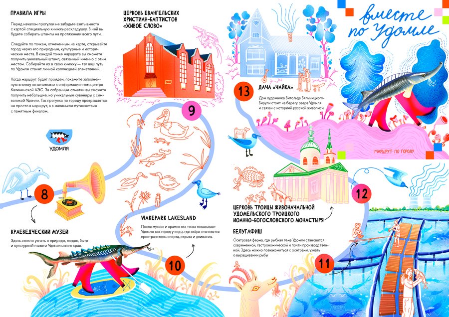
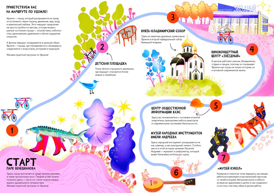
Overall Route