Location: Russia City: Rostov-on-Don Area: 650 sq. meters Year: 2019 This interior design project is a global rebranding for the network of authentic establishments belonging to the SAPORE ITALIANO group, which has been operating in Rostov-on-Don for 13 years. The client’s request was for a comprehensive and radical stylistic overhaul of the restaurant while preserving certain key details.

The core concept for the SI restaurant project in the Gorizont shopping center (Rostov-on-Don) is a stylized presentation of Italy’s most significant cities, which is visible throughout the entire interior—including the name of a specific city and a visual representation of its main landmarks and/or key structures.

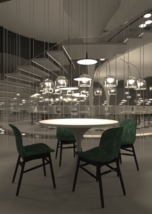
The interior features a predominant crisp white palette, complemented by round lamps that illuminate the restaurant space.
The background wall color, named Blue Blood, allows visitors to focus on each Italian city and its monuments, emphasizing the connection between the landmark and the city’s name.
Other combinations of materials in the restaurant’s interior—such as wood, metal, and glass—make the space both cozy and attractive.
Numerous planters with flowers and living plants literally transport restaurant guests from the southern capital of Russia to small corners of Italy.