Сommunication theory in the field of design
Communication theory in design views design as a purposeful and structured process of information exchange between a sender, most often the designer, and a receiver, namely the audience. Within this framework, design operates in a way similar to systems of message encoding and decoding, where information is transformed into visual or media-based forms and interpreted by viewers under different conditions, including the presence of noise or distortion. Scholars such as Philip Meggs, in Typography and Image: The Language of Graphic Design, describe this process as a sequence of stages in which an information source generates original content, and the designer converts it into a communicative signal. This signal is then perceived, processed, and interpreted by the audience, whose understanding may be affected by environmental, cultural, and perceptual factors.
Although this model is initially presented as linear, contemporary approaches to communication in design increasingly emphasize interaction rather than one-way transmission. The model develops into a multidirectional system in which meaning is actively constructed through engagement between designers and audiences. In this context, design goes beyond the creation of static visual objects and instead supports interaction, participation, and interpretation. Designers shape contextual experiences that encourage audience involvement, shifting the focus from passive representation to dynamic persuasion that can influence perceptions, attitudes, and behavior.
Various message design logics further explain how communicators adjust their strategies within specific design contexts. Expressive logic highlights personal values and subjective interpretation, conventional logic focuses on cooperation and shared understanding within established norms, while rhetorical logic emphasizes goal-oriented communication adapted to audience expectations and situational demands. These logics recognize communication as a complex and non-uniform process, allowing designers to align visual language, media formats, and messaging strategies with audience needs. Through this adaptive approach, design becomes an effective tool for information dissemination and behavioral influence.
Presentation for a general audience
Antre’s communication with a youth-oriented audience is developed as an integral part of a coherent brand system, grounded in a strategic approach to both visual and verbal positioning. The primary objective is to integrate the product into contemporary lifestyle contexts while preserving the brand’s premium, design-driven identity. Antre is positioned as a component of modern social gastronomy, associated with shared experiences and informal social interaction.
The communication focus shifts from the product itself to the consumption experience—tasting, sharing formats, and the social rituals surrounding them. The brand tone remains professional and restrained, yet accessible and relevant to younger consumers. Language is clear, concise, and emotionally engaging, supporting connection without sacrificing conceptual precision.
The visual strategy is based on lifestyle-driven scenarios that present the product within authentic social settings, such as small gatherings, aperitifs, and cultural leisure moments. This approach anchors the product in everyday consumption contexts while maintaining a refined aesthetic standard.
Digital communication is primarily executed through visually oriented platforms, with an emphasis on short-form content, influencer collaborations, and curated user-generated material. This structure reinforces social proof and supports organic brand visibility.
Brand storytelling selectively references Italian origin and artisanal quality, interpreted through a contemporary, minimal framework. Interactive tools—including limited-edition design variations and digital activations—are used to enhance engagement and brand recall rather than short-term promotion.
Overall, communication for this audience functions as a coordinated system of digital and physical touchpoints. The brand maintains a consistent visual and semantic code across all channels, conveying modern gastronomic sophistication without excessive stylistic emphasis or overt marketing expression.
Presentation for a professional audience
The communication strategy of this cheese snack packaging series is developed as an integrated brand system aimed at a professional audience, including designers, marketers, and product specialists. Packaging design is treated not merely as a visual shell, but as a structured tool for conveying information about the product, its quality, and its market positioning.
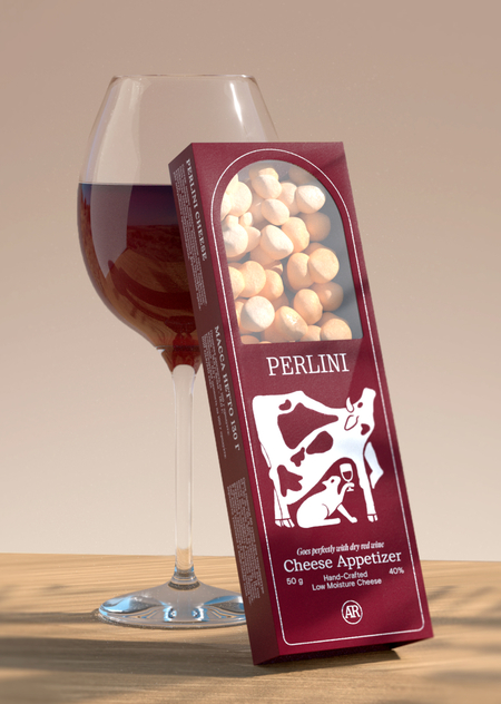
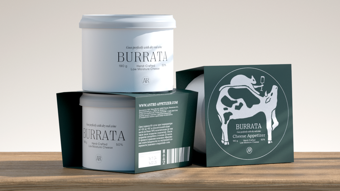
The series includes several packaging formats adapted to different types of cheese snacks (Perlini, Bocconcini, Burrata, Skamorza), while maintaining a unified visual and structural language across the range. The primary material is high-density designer cardboard with a matte lamination, which provides a premium tactile feel and ensures structural stability. Die-cut elements with transparent PET windows are used in selected formats, allowing partial visibility of the product and reinforcing consumer trust through visual transparency.
The color palette is based on deep, restrained tones—burgundy, dark blue, black, and dark green—which are commonly associated with artisanal quality, gastronomic culture, and product maturity. Light contrasting accents and monochrome graphic illustrations support clear information hierarchy and legibility. Color is applied consistently throughout the series and also serves a navigational function, helping to differentiate product types and flavors.
The graphic system relies on vector illustrations inspired by animal imagery and gastronomic rituals, strengthening the narrative of origin and tradition. Typography combines classic serif typefaces for product names with neutral sans-serif fonts for secondary information, creating a balance between emotional expression and functional readability. Printing is executed using offset technology, with optional finishing techniques such as spot varnish or embossing applied to logos and key visual elements. These details enhance the premium perception of the line. The packaging dielines are designed with both production efficiency and user experience in mind, featuring clearly defined cut and fold lines, a logical assembly structure, and convenient opening mechanisms that preserve the integrity of the form.
For professional application, the series is supported by a set of design assets and technical documentation. This includes:
- Packaging guidelines defining logo usage, color specifications (Pantone/CMYK), typographic styles, and graphic elements.
- Production dielines for each packaging format, with precise indications of cut lines, folds, and print areas.
- Material and finishing specifications, detailing cardboard types, window films, lamination methods, and printing techniques.
- Marketing layouts for point-of-sale materials and digital media, visually aligned with the packaging system.
Overall, this packaging series demonstrates how communication theory in design is implemented in practice. Every visual and structural decision serves a strategic purpose: to build a coherent brand image and ensure effective transmission of product information. The professional presentation of the line functions as a link between brand concept and its practical realization in production and marketing.
Communication theory as basis for the presentations
The Antre presentations are constructed on the basis of communication theory, which functions not as a post-rational explanation but as a guiding framework for both design and narrative structure. The application of theory is evident in how visual identity, storytelling, and channel integration are aligned to shape audience perception and brand meaning.
From the perspective of semiotic theory, the Antre brand communicates through a system of culturally coded signs. Typography, color palette, and layout references inspired by Italian wine labels operate as signifiers of tradition, craftsmanship, and quality. Serif typefaces and heritage-based compositions signal sophistication and authenticity, positioning the product within the cultural code of artisanal gastronomy rather than everyday snack consumption. These visual elements do not convey meaning directly but invite interpretation based on shared cultural knowledge.
At the same time, principles of narrative persuasion inform the structure of the presentations. Storytelling elements—such as brand characters, origin references, and ritualized consumption scenarios—are used to create emotional engagement and increase memorability. According to narrative transportation theory, audiences are more receptive to brand messages when they are embedded in coherent stories. In the Antre presentations, narrative functions as a bridge between rational product attributes and emotional brand associations.
The strategy also draws on social identity theory, particularly in the depiction of the product within group settings. Visual narratives emphasize shared experiences—tasting, social gatherings, and informal rituals—allowing young consumers to associate the brand with belonging and social connection. By presenting Antre as part of a collective lifestyle rather than an individual purchase, the communication reinforces community-oriented brand meaning.
Rhetorical communication principles are reflected in the way the presentations define both problem and solution. The need for high-quality, aesthetically refined, and socially relevant food products is framed as a contemporary lifestyle challenge, while Antre is positioned as a credible and desirable response. Logical arguments (material quality, design consistency, production standards) are combined with emotional appeals (atmosphere, enjoyment, cultural references), addressing both central and peripheral routes of information processing.
Consistency across touchpoints is explained through integrated marketing communication (IMC) theory. The presentations demonstrate how visual and verbal elements are maintained across packaging, social media, and experiential formats, ensuring coherence and reinforcing brand recall. Each communication channel is treated as part of a unified system rather than an isolated medium.
Finally, elements of interactive communication models are visible in the inclusion of feedback mechanisms such as audience engagement analytics and user response evaluation. This approach acknowledges communication as a dynamic process, allowing the strategy to adapt based on audience behavior and perception rather than remaining static. Overall, the Antre presentations illustrate how communication theory operates as a practical design tool. Semiotics, narrative persuasion, social identity, rhetoric, and integration principles collectively inform visual decisions, storytelling logic, and structural coherence. The project demonstrates that theoretical frameworks can actively shape branding practice, ensuring that every communicative element serves a strategic and conceptually grounded purpose.
Communication Theory: Bridging Academia and Practice // edu.hse.ru URL: https://edu.hse.ru/course/view.php?id=133853 (дата обращения: 12.12.2025).
Shannon C. E., Weaver W. The Mathematical Theory of Communication // University of Illinois Press. URL: https://press.uillinois.edu/books/?id=p070129 (дата обращения: 12.12.2025).
Chandler D. Semiotics: The Basics // Routledge. URL: https://www.routledge.com/Semiotics-The-Basics/Chandler/p/book/9781138232936 (дата обращения: 12.12.2025).
Fisher W. Narration as a Human Communication Paradigm [Электронный ресурс] // redmonky.net. URL: https://redmonky.net/utpa/4324/fischer.pdf (дата обращения: 01.12.2025).


