Concept
The subject of this visual study is the evolution of the INTERVALS festival’s advertising campaign. This topic was chosen because INTERVALS has transformed from a local cultural event into a prominent media art festival with a recognizable visual language and a sustained communication strategy in a relatively short period. Interest in the topic stems not only from the festival’s development itself but also from the fact that its advertising campaign clearly reflects a broader process: how a cultural event builds its own brand, alters its approach to the audience, and adapts its visual solutions to new scales and venues. In this sense, INTERVALS’s promotional materials are not merely announcement tools, but an essential component of the festival’s identity.
Research material is selected based on the principles of chronological representativeness and visual comparability. The corpus will include promotional and communication materials from various years, allowing us to trace the changes in the festival’s identity: posters, flyers, teasers, social media posts, promo videos, outdoor advertising elements, as well as materials from the official website and media publications. For the analysis, materials belonging to several key periods of the festival’s development will be chosen: the early stage, the active expansion phase, and the peak popularity period. This approach will allow us to observe the overall dynamic of the visual strategy.
The principle of the research structure is built around a chronologico-thematic model. The work will be divided into several sections: first, the context and positioning of the festival will be examined; second, the visual materials will be analyzed by period; next, recurring elements and changes in the graphic language, composition, and communication channels will be identified; and finally, early and later advertising decisions will be compared. This structure allows for the integration of historical perspective with formal visual analysis. Within the sections, materials will be grouped by year.
The principle guiding the selection and analysis of textual sources is to utilize materials that help interpret the visual elements without replacing them. The foundation will consist of interviews with the organizers, festival publications, texts from official resources, articles on media art and event marketing, and brief descriptions of the festival programs. The textual sources will be used to clarify the context—the goals of the campaign, changes in target audience, the logic behind location selection, and the stated conceptual meanings. During analysis, it is crucial not to merely retell the texts, but rather to correlate them with the visual solutions, examining how verbally articulated ideas are realized in the graphics, animation, and promotional messaging.
The key research question can be phrased as follows: How has the INTERVALS festival’s advertising campaign evolved as the festival has developed, and what do these changes reveal about the transformation of the festival itself as a cultural brand?
The research hypothesis is that the evolution of the INTERVALS advertising campaign reflects a shift from an experimental and locally focused visual language to a more systematic, large-scale, and institutionally structured form of communication.
Navigation Menu
— Introduction
— Early Stage 1) 2015: Conception emerges 2) 2017: Transition to festival format
— Active Development 1) 2019: Integration into the urban environment 2) 2020: Experimental format 3) 2021: Continued development
— High Popularity 1) 2022–2026: Formation of the city brand
— Conclusion
Introduction
Festival Intervals—one of the most notable contemporary projects at the intersection of media art, music, and the urban environment in Russia. Originating in 2015 as an experimental gathering for artists and musicians at the «Sklad» club in Nizhny Novgorod, it has evolved over several years into an international media art festival that annually draws over 500,000 spectators and spans dozens of locations in the city’s historic center. The festival operates via a walking format: over a few days, the city transforms into a large-scale media exhibition, featuring media installations, mapping shows, and sound and light performances on building facades, in abandoned structures, and across various other spaces.
In the Russian context, promotional campaigns for such festivals are often built upon a comprehensive PR and digital strategy, where digital tools, media outreach, and offline activities function as a unified system. Initially, applications for participation are collected and baseline interest is established. Subsequently, additional media hooks are created to generate wide media resonance, while simultaneously promoting associated projects—exhibitions, auctions, and educational programs. Partnerships with major corporations, such as telecommunications operator T2, play a crucial role. T2 acts as a partner for INTERVALS, integrating into the multimedia festival as part of its event strategy, thereby underscoring the brand’s technological sophistication and innovative status.
Early Stage
2015: Emergence of the concept
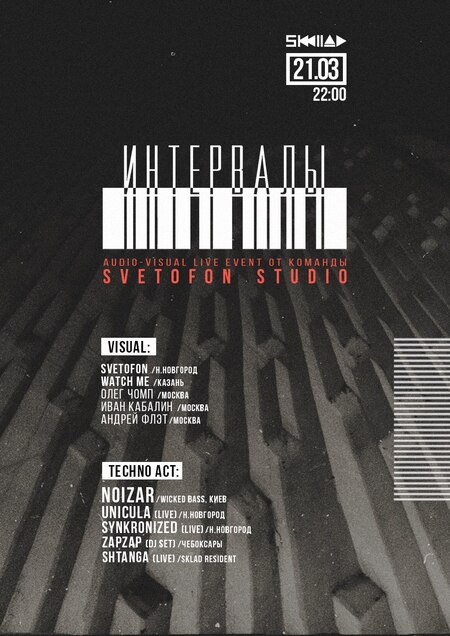
In 2015, Intervals could not yet be called a full-fledged festival. It was an event organized by the SVETOFON team at the Nizhny Novgorod club SKLAD, blending music from DJs with light installations from artists. The event format was intimate, targeting a niche audience. The goal of the promotion was targeted engagement within the cultural community, where venue recognition, trust in the organizers, and the feeling of an «insider» event were more important than broad media coverage. Therefore, the main audience learned about the festival primarily through social media.
The concept of Intervals was established as early as 2015: it connected music, visual experimentation, and the very principle of the «interval» as a space between disciplines.
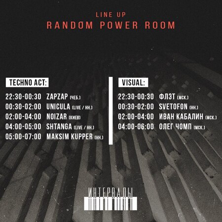
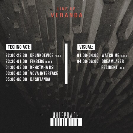
Posts from the Intervals 2015 community
The visual materials share a consistent pattern of volumetric vertical blocks and horizontal lines, which unifies them and instills a sense of belonging. Additionally, counter-forms—used in both the logo and the headlines—are employed. Because the grain effect was once associated with creativity, it attracts a relevant audience. In publications about artists, designers actively utilize various effects, such as pixelation and glitch, striving to convey a technological atmosphere surrounding the event. The style appears cohesive and unique, which helped the publications stand out within the general news feed.
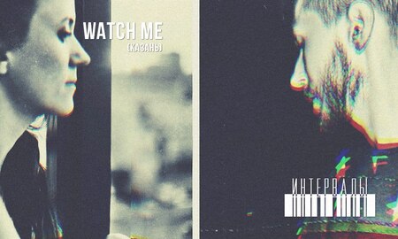
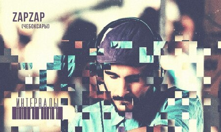
Posts from the Intervals 2015 Community
In 2015, the festival targeted a niche audience and had limited promotional materials, but those that existed successfully captured attention.
2017: Transition to a Festival Format
In 2017, Intervals transitioned from an intimate format to a full-fledged festival. Three programs were organized at Nizhny Polygraph: a daytime program, an educational program, and a night program. The festival’s advertising began operating as a cohesive system. This system integrates the event listings, digital publications, program structure, and visual navigation. Although the materials are still limited, they allow one to trace the evolution of the promotional approach. The recruitment of partners, primarily local Nizhny Novgorod brands, also had a significant impact.
The basis of the visual communication is a monospaced font that references technology, and patterns composed of lines symbolizing light beams and musical waves.
The poster resembles a techno-rave flyer, which appeals to electronic music fans. Although it stands out against the advertising posters of that era, it cannot be called the most functional: the abundance of directional cues confuses the viewer, the richness of colors distracts attention, and it is not entirely clear what the piece aims to convey.
Intervals 2017 Poster
This space also features more promotional videos and teasers. They are unconventional for the viewer, capturing attention through their raw energy and vividness. The primary technique employed is rapid scene cutting and synchronizing the music with the footage, which lifts the viewer’s mood. After watching such a clip, one feels like going to a party.
A need arises for an event map. Overall, it is clear and accessible, but the low contrast between black and red, along with the small, illegible font, could be off-putting.
Intervals 2017 Festival Map
In 2017, the festival had not yet developed a unified visual identity, yet it attracted an audience by contrasting with other events in the city.
Active expansion
2019: Implementation in the Urban Environment