Topics
- Concept
- Hypothesis
- Woodcut
- Lithography
- Etching
- Conclusion and Hypothesis Response
- Bibliography
- Image Sources
Concept
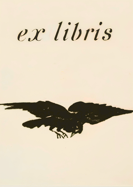
Exlibris is a bookplate that certifies the owner of the book.
In this visual study, the exlibris is interpreted as a graphic element where the choice of printing technique dictates the visual style, the character of the line, image density, and principles of compositional construction. Despite their small scale, exlibris function as self-contained design systems, unifying typography, illustration, line rhythm, texture, and plasticity. This research emphasizes that the technical foundation of the print not only impacts the aesthetic of the exlibris but also defines the logic of its construction, the repertoire of expressive means, and the principles of visual communication.
My research utilizes three techniques as materials: woodcut, lithography, and etching. Each possesses unique limitations and capabilities that are reflected in graphic design contexts through the specificity of the stroke, the level of detail, contrast, the balance between filled and empty space, methods of highlighting key elements, and the integration of text into the exlibris composition.
Woodcut forms its composition through high contrast, dense crisp contours, and rhythm expressed through spatial fragmentation. Works made with this technique appear flat, decorative, and graphically unified. The style is quite simple and generalized—it emphasizes the significance of the shape, the equilibrium of forms, and the expressiveness of the contours. These characteristics essentially form a more «designerly» approach—with a clear structure and an emphasis on form.
Lithography brings the graphic closer to drawing through its expanded capabilities for tonal expression. It is characterized by smooth lines and the ability to convey complex transitions between light and shadow. The first thing noticeable when viewing works in this technique is the shift from decoration to a poster-like style. In my opinion, it allows designers to convey emotions and the stylistic codes of their time.
Etching allows for the introduction of depth, detail, and the demonstration of the entire complexity of an image’s graphic structure into the work. In this technique, the line is responsible for shaping, movement, and sometimes depth. An exlibris created using etching is characterized by a high density of lines, the ability to convey space, volume, and texture. In my view, this technique is quite important for graphic design because it establishes a new compositional principle—a structural one—and also allows for work with depth, the direction of the line, and assembling an image from numerous small elements.
The research compares the visual solutions generated within three different techniques, examining methods of compositional construction, line character, and the integration of text and other graphic devices.
Hypothesis
The specifics of printing technology form the foundation of the exclibris visual language. This technology is a determining factor for the character of the lines, the degree of detail rendering, the depth of detail, the composition, and the methods of embedding text within the image. This results in significant variations in the graphic execution of exclibris created under different production conditions.
Woodcut
Xylography involves forming an image by cutting away areas of the background, preserving the relief surfaces that subsequently transfer the paint onto the paper.
Ex Libris Loutky. Hořánek Jaroslav. 1987.
Ex Libris Maska. Hořánek Jaroslav. 1978.
Yaroslav Khoranek’s works are distinguished by the expressiveness of their graphic language, which is based on dense, confident, and contrasting lines.
Ex Libris Escape from the Unknown, Ex Libris Lotte Hausweiler. Hořánek Jaroslav. 1978–1987.
Ex Libris Koupání, ex libris Lásky raka. Jaroslav Hořánek. 1987. 1985.
In his ex-libris, the compositional structure is clear and centrally organized. The line sets the rhythm and shifts the focus to the silhouette, transforming the work into an ornamental system.
Ex Libris Hare Smoking a Pipe. Knight Václav. 1915.
Ex Libris Hand Holding a Skull. Knight Vaclav. 1915.
By adding decorative frames, Wacław Rytirz attempts to visually organize the images so that the text integrated into the overall system appears consistent.
Ex Libris Jos. Čížek. Knight Václav. 1941
The artist structures their work by establishing a hierarchy between deep color fills and incised fine lines.
Ex Libris Girl with a Parasol. Josef Vachal. 1912.
Ex Libris Pegas. Váchal Josef. 1936.
Joseph Wahl structures his works around a rhythm generated by the movement of the contour, which guides the viewer’s eye and adds a greater sense of dynamism. Furthermore, the artist employs decorative elements, subordinating them to the structure of the exlibris and compelling them to function within a unified visual system—much like the text, which is equated with graphic elements.
Ex Libris Karel Sedláček. Pařízek Vladimír. 1941.
Woodcut is characterized by the rigidity of its lines and limited tonal range, which results in strong contrast. It is often paired with a decorative frame for additional visual organization.
Lithography
Lithography is a printing technique where images are created on a stone or metal plate and then transferred onto paper.
Ex LibrisTre donne. Josef Hoffmann. 1903.
Ex Libris for Max Woeller. Fritz Helmuth Ehmcke. 1908–1912 (approximate)