A company creating genetically modified plants that function as intelligent, natural climate control centers for indoor environments. They not only cool, humidify, and purify the air, but they also take care of themselves, reporting their needs to you.
Create a logo for LIORA, a botanical biotech company developing genetically modified plants that help regulate indoor air quality, humidity, temperature, and potentially light. The idea behind the brand is «nature becoming infrastructure»: living plants taking on the functions of everyday climate-control devices. Design an original emblem that feels like a small, unfamiliar living organism. Combine curling stems, soft leaves, and a strange flower into a cohesive, recognizable shape. Give it a gently irregular, hand-drawn character, with hints of Art Nouveau and folk ornament. Use substantial shapes and open spaces so it remains clear at a small size. Avoid turning it into a detailed botanical illustration. The biotechnology should be suggested through the way the forms grow, branch, and connect. Let the internal spaces evoke circulation, exchange, and balance. A subtle letter L may emerge naturally from the stems, but do not force it. The plant should feel familiar at first glance and slightly otherworldly on closer inspection. Pair the emblem with the name LIORA in refined, readable serif lettering with soft curves and a natural rhythm. The symbol and lettering should feel equally considered and work both together and separately. Use deep burgundy or forest green on a warm cream background. Make sure the logo also works in a single solid color, suitable for printing, embroidery, embossing, and signage. The result should feel warm, intelligent, tactile, trustworthy, and gently magical. Avoid generic eco-leaf symbols, literal circuit boards, DNA helices, medical imagery, futuristic fonts, rigid geometry, neon colors, gradients, and 3D effects. Present three coordinated versions on a clean background: the emblem with LIORA, the wordmark alone, and the emblem alone. Focus on the logo itself, without product mockups or additional slogans.
/Let’s change the name and use KRONA. I’m clarifying the requirements for the logo. Use a serif font that looks strict and expensive, and at the same time pairs well with the floral logo. I want symmetry and smooth botanical lines in the logo; it shouldn’t be cluttered. It could resemble the Loewe brand logo.
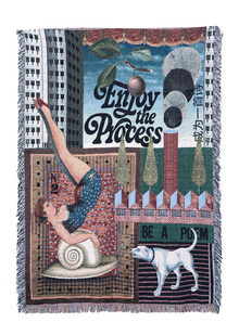
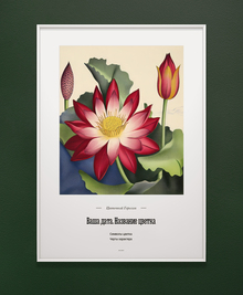
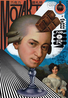
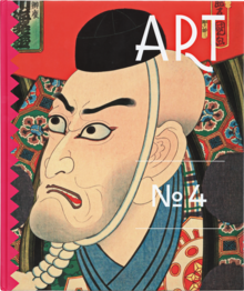
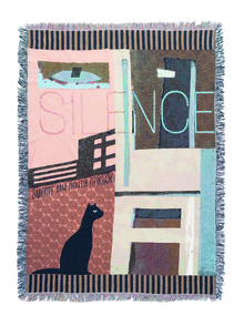
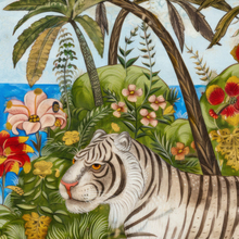
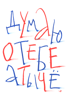
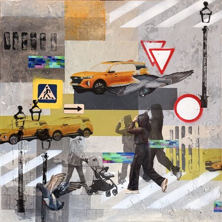
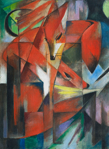
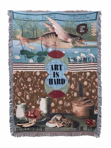
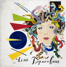
Use the logo provided earlier in this chat; you may use the logo and name separately—employing only the name in some instances and only the logo in others—in strict accordance with the original design. Build a visual language around it without redrawing it or creating a different brand name. Creative Direction Draw inspiration from contemporary cultural posters, expressive textile design, and botanical graphics. Give the work a vibrant graphic identity: subtly unconventional, refined, and instantly recognizable. Specifically reference these examples: — The striking scale and cropped botanical ornamentation of the fabric banner. — The flowing stems, decorative rhythm, and tactile quality of the print on the wine label. — The bold interplay between solid color and organic cut-out shapes on the pink posters. Do not copy brand names, images, or exact compositions. Translate these qualities into an original campaign. Develop a single, distinctive botanical motif and vary it throughout the series. This could be a fictional flower with an unusual silhouette, intertwining curved stems, or an organic shape that generates striking negative space. Ensure it is large enough to anchor the composition; feel free to crop it at the edges. Avoid scattering small leaves or decorative fillers. Utilize flat, two-dimensional illustrations reminiscent of woodcuts, silkscreen prints, or meticulously rendered textile patterns. Combine solid shapes with isolated areas of fine, engraved detail. Avoid photographs of actual plants, photorealistic flowers, 3D plants, glowing foliage, scientific symbols, or futuristic effects.
Color and Typography Utilize a muted yet memorable color palette: dusty pink against a rich burgundy background, or warm parchment against a nearly black forest green background. Select one of these combinations as the campaign’s primary palette and employ the other sparingly. Colors must be subdued, but compositions should achieve a strong tonal contrast. Steer clear of washed-out palettes in shades of beige and sage, neon colors, or gradients. Select typography that harmonizes with the existing logo. An expressive serif typeface can be paired with a precise, understated sans-serif typeface for fine details, provided it complements the logo. Integrate headlines into the composition—carefully consider line breaks—and choose a confident scale.
Image 1 — A series of three posters in a single photograph. Show three vertical posters side by side, photographed head-on, against the backdrop of a garden or a Gaudí-style house. Consider them a design triptych: one featuring a dominant, dramatically cropped botanical motif; one driven by large typography; and one built around an expressive organic cutout or ornamental frame. Unify them using a common graphic language, color palette, and grid, while ensuring each maintains its own unique composition.
Image 2 — Vertical Fabric Banner. Use the attached hanging fabric banner as a guide for material, scale, and presentation style. Create a dense, enlarged botanical print with beautifully cropped edges. Incorporate the existing logo into a specially designated opening within the pattern so that it remains clearly visible. Use the logo as the primary typographic element; no slogan is required. Display the entire banner on a simple metal bracket against the backdrop of a Gaudí-style house.
Image 3 — Horizontal banner. Create a design specifically for this large-format medium. Place the text «A Different Atmosphere» in a bold font, balancing it with an enlarged element from the campaign’s botanical motif. Position the existing logo in a secondary location with precise alignment. The composition should have a distinct, directional rhythm and be recognizable at a glance, even from a distance. Photograph it head-on from a passing truck, with green vine-like elements trailing from it; the background should be blurred as if in motion. Image 4 — Exhibition Announcement. Create a visually appealing poster for a cultural event titled «The Living Room, ” with the only additional information being „Exhibition and Talk“ and „Coming Soon.“ The poster depicts people sitting in a very cozy apartment on a floral-patterned sofa around a round rug; behind each person is a single flower. Place all text centrally with center alignment. Use a bold, ornamental layout. Present it in a simple street-poster frame, with the framed poster occupying most of the image. Keep the photo layout understated and realistic: natural lighting, subtle material texture, minimal surroundings, and a clear view of the artwork. The design itself should make an impression. Submit four separate images rather than a single presentation board. Before you begin, study the attached examples and settle on one strong visual idea that can unify the entire campaign.
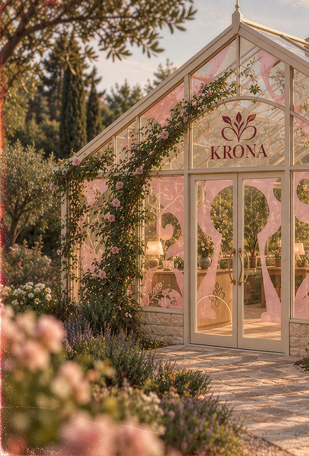
Create an architectural visualization of KRONA’s flagship greenhouse and visitor space, where the company showcases genetically modified plants designed to regulate indoor air quality, humidity, and temperature. The space should feel like stepping into the garden behind the posters: warm, intimate, quietly enchanting, and rich with botanical detail. Combine the charm of a traditional glass conservatory with the refinement of a contemporary botanical design studio. Architecture and Garden Design a human-scale greenhouse featuring a pitched glass roof, slender warm-white or natural-green metal framing, a low stone or weathered-brick base, and elegant double doors. Draw inspiration from the proportions and delicate architectural details of the attached greenhouse references. Surround it with a lush yet carefully composed garden: layered plantings, climbing roses, soft pink and pale-yellow flowers, natural greenery, and a stone path that clearly leads to the entrance. Allow some plants to climb around the doorway and lightly frame the glass structure, while ensuring the architecture remains visible. Incorporate restrained curved details in the entrance ironwork or door handles, inspired by the flowing stems of the KRONA identity. Maintain structural plausibility for the building, featuring realistic glazing, joints, and proportions. Interior and Purpose Design this as a functional brand space comprising three connected areas: — A welcoming reception and consultation area equipped with a compact timber desk and discreet KRONA signage. — A plant demonstration area featuring generous worktables, integrated planting beds, and a few carefully displayed specimens. Utilize small botanical labels and unobtrusive environmental sensors to suggest the company’s research. — A comfortable lounge where visitors can experience the environment: a curved sofa upholstered in a subtle botanical fabric, relaxed chairs, and a round rug centered around a low table.
Incorporate the engraved botanical ornament, flowing silhouettes, warm paper tones, and romantic garden atmosphere from the final reference image throughout the interior. Apply these details selectively—perhaps a botanical fabric panel, patterned sofa upholstery, delicate etched-glass borders, or a small framed campaign poster. Allow each motif breathing room; avoid covering every surface with patterns. Preserve the existing KRONA wordmark and botanical emblem exactly as provided. Position the branding naturally on the entrance glass and within one or two interior details, maintaining a modest, elegant scale. Do not devise a replacement logo. Utilize warm ivory, soft blush pink, pale sunlight yellow, and varied natural greens. Small burgundy accents may echo the poster artwork, but ensure the space remains light and welcoming. Avoid introducing blue as a decorative color. Materials should evoke a sense of tactility and authenticity: painted timber, natural stone, aged terracotta, linen, matte ceramic, subtly patinated metal, and clear glass. Let the fairy-tale quality emerge from filtered light, climbing flowers, delicate ornamentation, and glimpses through the planting.
Lighting and Photography
Render the space using soft, late-afternoon sunlight filtering through the glass roof, complete with gentle leaf shadows and warm reflections. Supplement with a few discreet interior lights to add depth. Ensure detail is preserved in both the plants and the architecture. Present the scene as convincing architectural photography—featuring naturalistic plants, realistic materials, and restrained color grading. Slightly blurred foreground flowers can frame the view, but the primary architectural elements must remain sharp. Steer clear of glossy CGI surfaces, exaggerated wide-angle distortion, neon lighting, bioluminescent plants, or science-fiction equipment.
- Exterior Arrival View: A three-quarter view showcasing the entire greenhouse, the entrance path, and the surrounding garden. The building should occupy roughly two-thirds of the composition. Ensure the KRONA entrance signage is subtly visible.
- Wide interior view: an eye-level perspective from near the entrance showcasing the relationship between the reception area, plant demonstration tables, and lounge, with the glass roof visible above.
- Intimate interior detail: the lounge next to the planting and a green-painted workbench, highlighting botanical textiles, tactile materials, filtered sunlight, and one carefully integrated brand detail. Maintain the same architecture, furniture, planting, and materials across all three views. Deliver individual images, not a collage. The final result should feel like a distinctive, real place created for KRONA, with the visual character of the attached posters translated into architecture and everyday experience.
Create a cohesive collection of merchandise, printed materials, and interior accessories for KRONA, a brand developing genetically modified plants that regulate indoor air quality, humidity, and temperature. Use the KRONA poster image as the main reference for the brand identity: engraved botanical illustrations, flowing stems, expressive organic shapes, elegant serif typography, blush pink, warm ivory, and natural garden imagery. The collection should feel like objects from the same world as those posters and the brand’s romantic greenhouse space. Use the existing KRONA wordmark and botanical emblem exactly as provided. Preserve their proportions and lettering. You may use the emblem alone, the wordmark alone, or the complete logo where appropriate.
Design Direction
Give the collection a refined, slightly fairy-tale character through botanical ornament, tactile materials, and thoughtful details. Make every object desirable in its own right, with a distinct composition suited to its shape and function. Alternate between richly patterned pieces and quieter objects. Use enlarged, cropped botanical engravings, delicate curved borders, and intentional negative space. Avoid simply placing the same logo in the center of every item. Use warm ivory, soft blush pink, pale butter yellow, and natural greens, with restrained burgundy accents inspired by the posters. No blue, neon colors, or glossy futuristic effects. Typography should be elegant and airy, with precise alignment and generous margins. Keep the branding legible and the text minimal. Use realistic construction, materials, and finishes throughout.
-Product tags Design a small collection of thick, textured paper tags for plants and merchandise. Combine a rectangular format with a subtly shaped tag inspired by the curves of the botanical emblem. Include a punched hole and natural cotton cord. Show both the front and back: one side featuring an expressive botanical composition and the other presenting a neatly organized information layout. Avoid counterfeit QR codes and invented scientific claims. -Staff badges Design practical, highly readable name badges with a clear hierarchy: a small KRONA logo, the individual’s first name, and a discreet title such as «Botanical Specialist.» Use warm ivory as the background with green or burgundy lettering and include a restrained botanical accent. Pair these with woven fabric lanyards featuring a subtle stem pattern. Ensure realistic clips and attachment points are shown. -Bag charms and keyrings Translate the existing botanical emblem into a small sculptural charm, maintaining its recognizable silhouette. Use enamelled metal with a softly brushed finish, or opt for carefully stitched fabric with embroidered details. Pair the charm with a small wordmark tag and a simple ring or clasp. The pieces must feel refined, tactile, and realistically manufacturable, featuring smooth edges and sturdy connections.
— Reed diffuser Create a home-fragrance reed diffuser in a matte ceramic or softly frosted glass vessel, using natural reeds and a restrained botanical label or embossed emblem. Pair it with a textured paper box that features a more expressive version of the campaign ornament. Present it as a fragrance accessory, without making claims about air purification or room regulation. Ensure the vessel proportions and packaging construction are believable.
-Umbrella Design a full-size umbrella featuring botanical artwork arranged across the canopy’s radial panels. Incorporate flowing stems and oversized engraved flowers, maintaining negative space between the motifs. Integrate the KRONA wordmark subtly near one edge. Consider a patterned exterior paired with a serene blush or ivory interior. Include a curved wooden handle, realistic ribs, visible seams, and a matching fabric sleeve. Present the umbrella open to showcase the complete pattern.
-Brand and plant catalog Design a beautifully produced catalog featuring a tactile cover, refined typography, and a distinctive botanical composition. Showcase both the cover and an open interior spread. Utilize a clear editorial grid, generous margins, atmospheric greenhouse photography, botanical illustrations, and carefully structured plant information. Keep body text secondary at this viewing distance—avoid large blocks of illegible filler. Use the existing brand name and the simple title, «Living by design.»