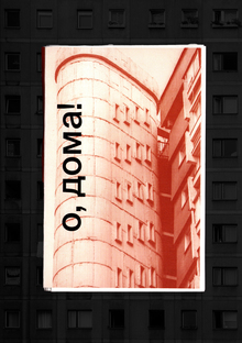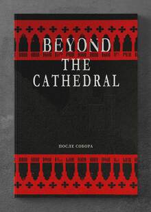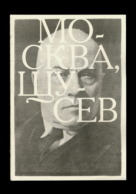
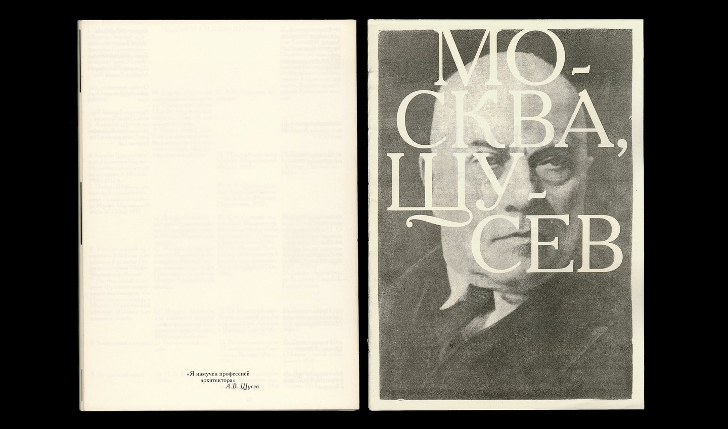
This zine focuses on the Moscow buildings designed by Alexey Shchusev. The evolution of the architect’s work is illustrated through changing typography, gradually transitioning from the fluid lines of Neo-Russian architecture to the sharp structure of Constructivism.
Chapters: I. Neo-Russian Style II. Eclecticism III. Constructivism IV. Stalinist Empire
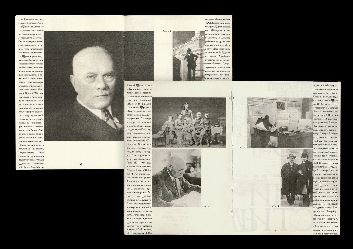
The zine features spreads at the beginning and end detailing Alexey Shchusev’s biography.
Chapter headings start on the same spread where the previous chapter ends.
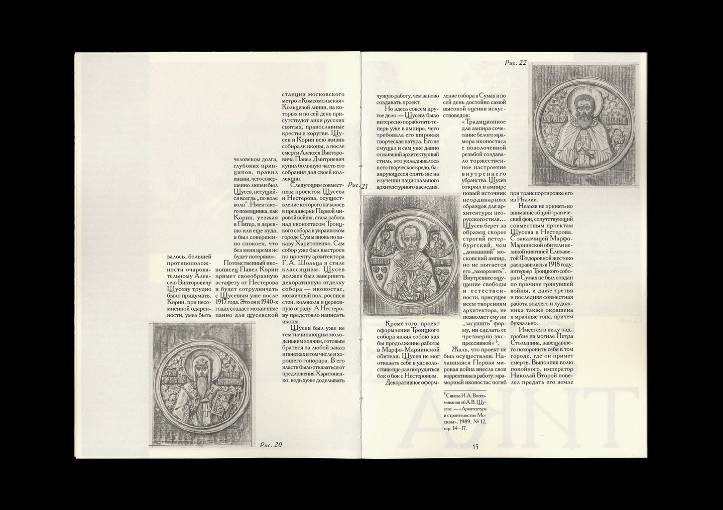
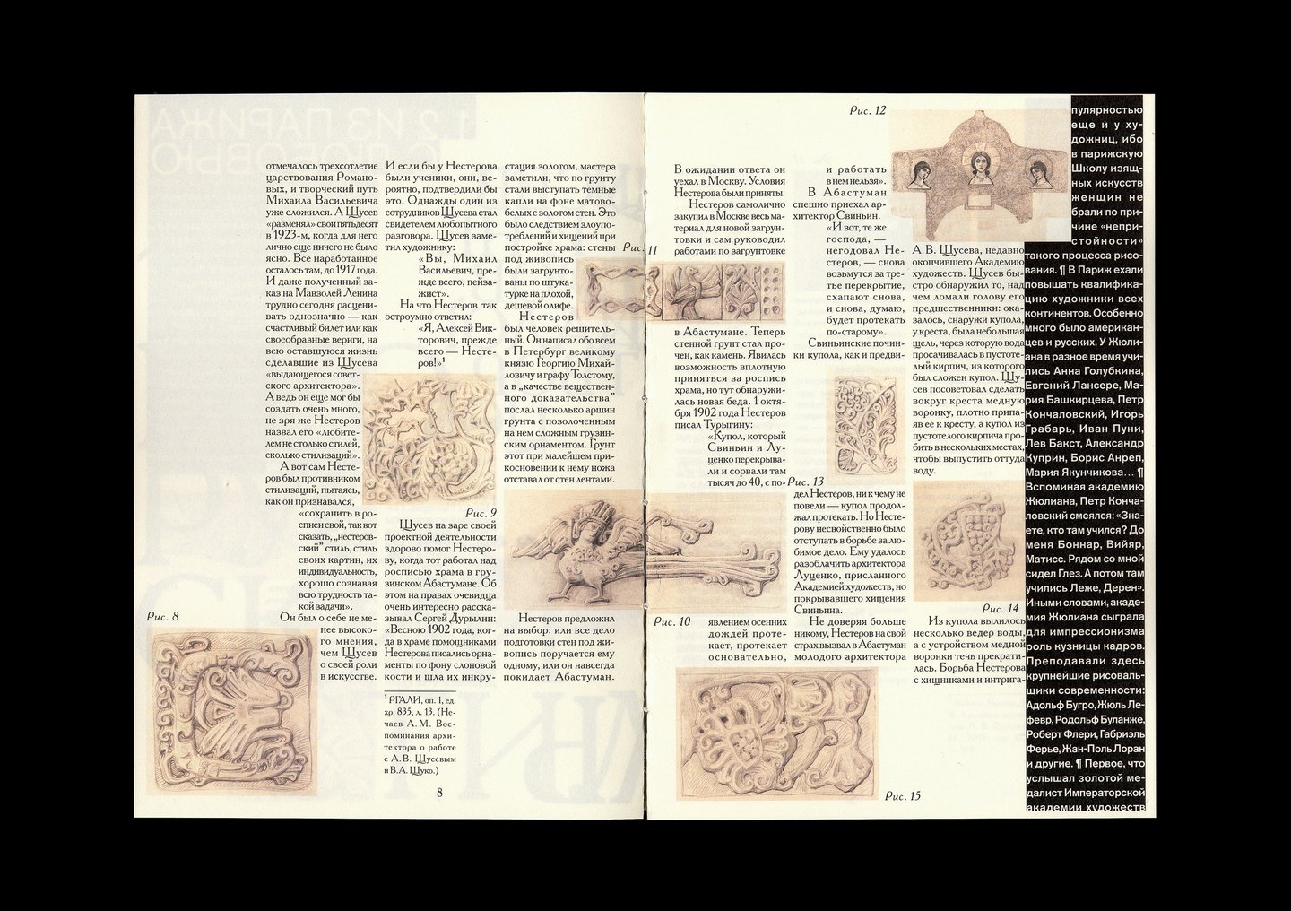
Chapter One is dedicated to Shchusev’s «neo-Russian» structures.
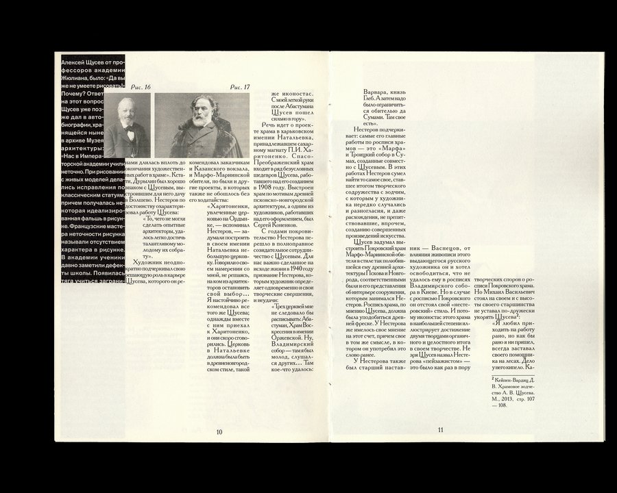
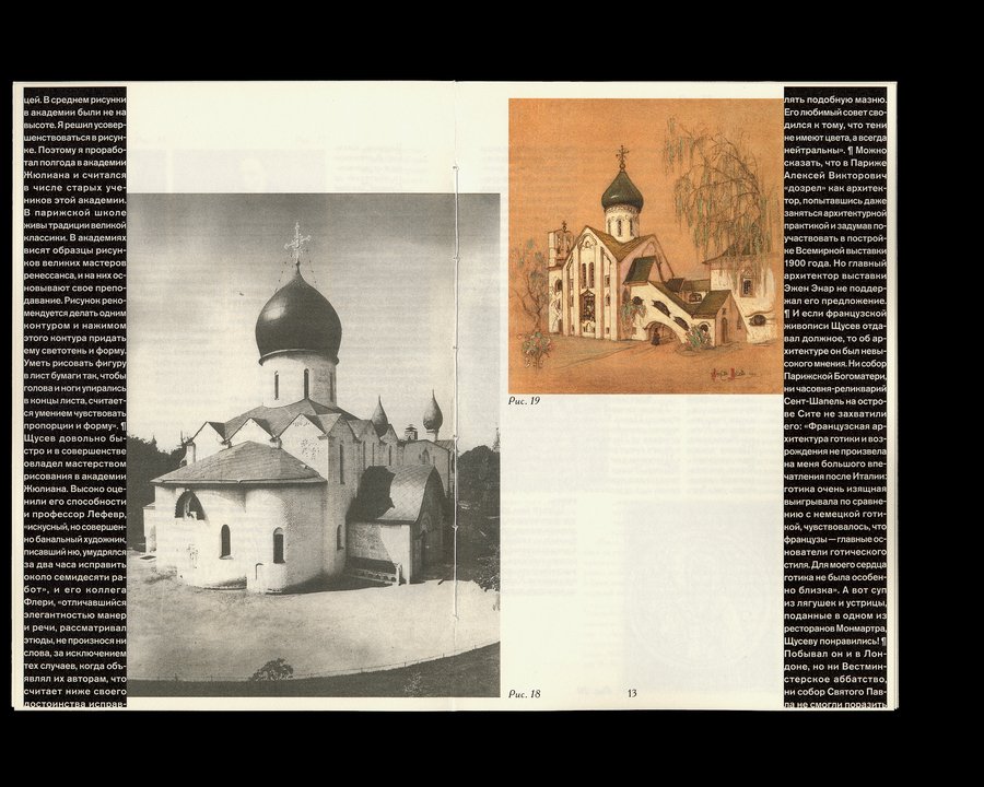
Format: 148×210 mm
56 pages
Fonts: Academy, Akzidenz-Grotesk Pro
Paper: Colorlab 110 g/m2
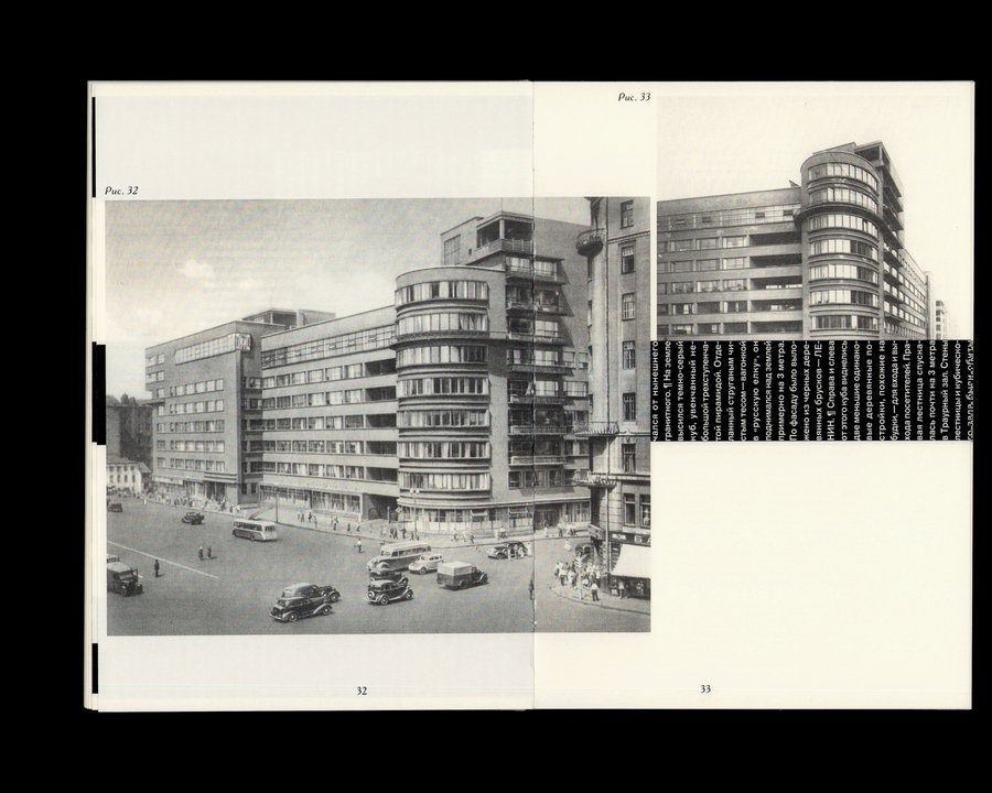
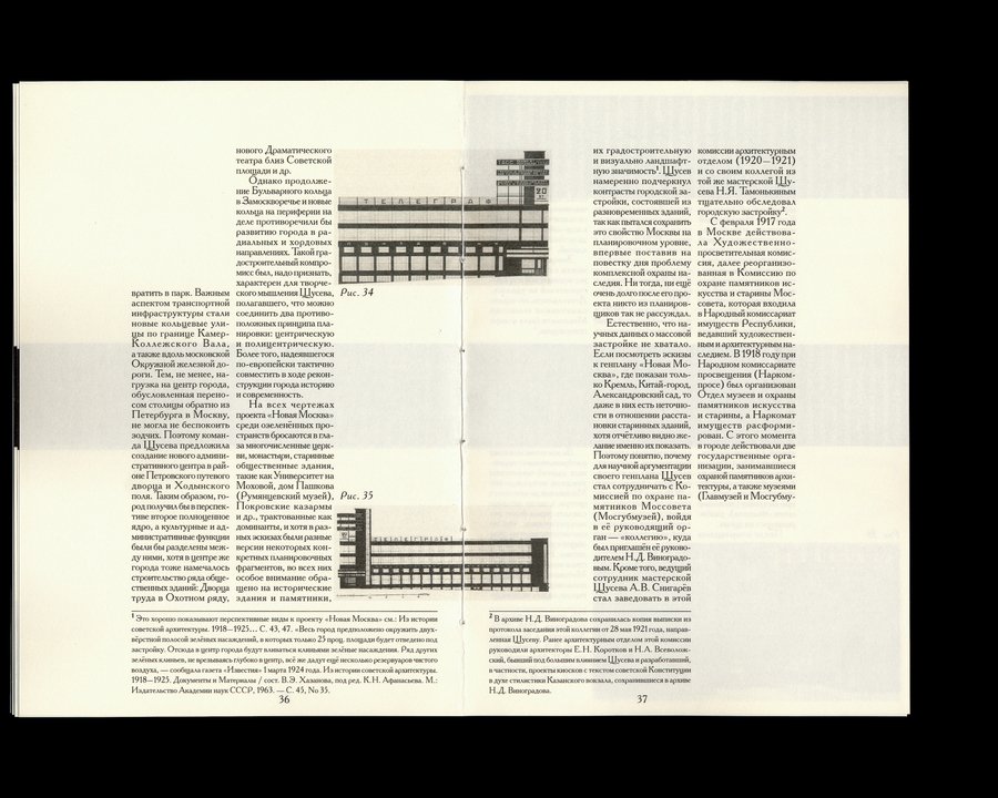
The visual language is inspired by Soviet typography from the 1930s–1950s. The Academy typeface was frequently used for printing architecture compilations and journals, both in pre-revolutionary Russia and the USSR. In my work, the centered justification and strict margins for the body text are used to achieve a sense of «density» and elegance in the typesetting.