Concept
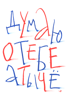
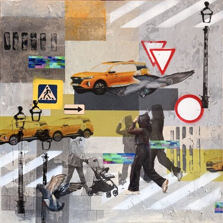
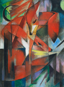
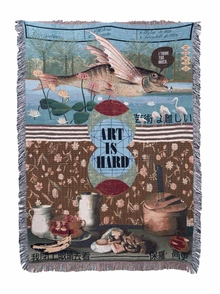
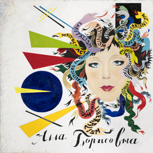
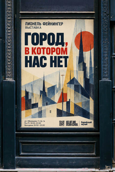
This poster series is dedicated to the exhibition «City Where We Are Not» by Lionel Feininger. The graphic posters draw inspiration from his work, while the typography reflects the spirit of the era in which the artist lived and created.
Logo
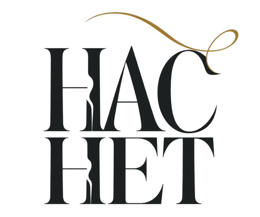
Create an original, concise logo for the Russian art print startup «NAS NET.» The exact Cyrillic inscription must be «НАС» above «НЕТ.» Use tall, narrow letters with expressive serifs—elegant, modern, and highly legible. Add a thin vertical break between the letter elements; optionally, include a delicate stroke of muted gold above the inscription. The primary color should be deep graphite #24292A, with gold #B38A38 used only as a subtle accent. The design must be a crisp, flat graphic on a completely transparent background, including surrounding margins. No mockups, textures, gradients, shadows, frames, illustrations, or additional text. High resolution, PNG.
Graphic Posters
was
became
it became
became
Compared to the first image, the following has changed in the others:— The text was reduced: the phrase «The City Where We Are Not» was replaced with the prominent «WE ARE NOT.» Information about the exhibition, the artist’s name, the address, operating hours, logos, and QR codes were removed. — The composition was altered: the illustrations became larger and gained more surrounding negative space. The main focus is now on the figures and the short title. — The typography was updated: the headline is set in all caps. The second image uses a high-contrast serif font, while the third and fourth use a thin, elongated typeface. — The core imagery remains: faceless figures, geometric costumes, and floating headwear. The colors and contours appear softer due to the paper texture and lighting. — A realistic presentation was introduced: instead of flat mockups, finished printed pieces with volume, shadows, and noticeable texture are shown.In the second image, the central poster is transformed into a standalone poster on a pink background; a small star element has been added to the lower right.In the third image, the left poster has been adapted into a card within a paper folder. Debossed «WE ARE NOT, ” a green fabric ribbon, and other print materials have been added.In the fourth image, the right poster has become an interior framed print. Surroundings have been added: furniture, a lamp, plants, and sunlight.
Typeface Posters
It has become
The following changes were made from the first image to the second:— Presentation: Flat poster mockups transformed into a volumetric composition—the posters stand against a wall, and the central one is framed in gold. — Text: The exhibition title for Lionel Feininger, description, address, operating hours, QR codes, and logos were removed. A small inscription, «WE ARE GONE, ” was added to the bottom. — Typography: The combination of calligraphy and a simple font was retained, but the sizes, spacing, and placement of the words were adjusted. The lettering appears sharper. — Color: The shades have become warmer—creamy, beige, and golden. — Textures: The effect of aged paper was preserved, while the surface appears softer and more natural. — Environment: A stone surface, sunlight, plant shadows, dried flowers, postcards, and an envelope with a gold seal were added.As a result, the exhibition posters adopted the presentation style of interior artwork and corporate stationery.
Location
A conceptual shop, gallery, studio, or production workshop. Show the interior featuring brand graphics and products.