ABOUT THE PROJECT
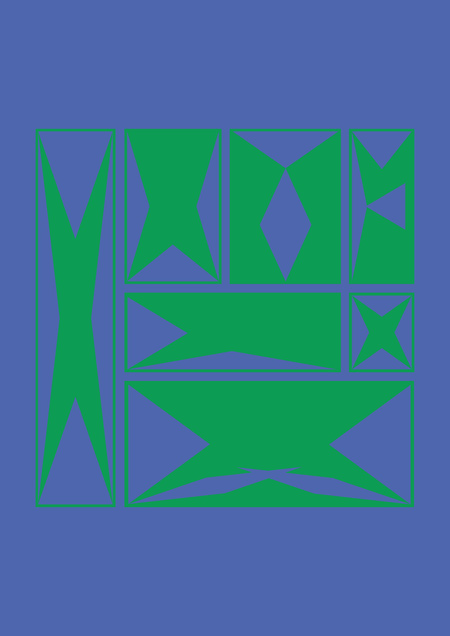
NOTGEO is an experimental display typeface that explores the potential of geometry in typography. Its name alludes to the contradiction between the geometric nature of the forms and the absence of a strict geometric system. Despite utilizing simple geometric elements, the letters do not adhere to a single modular grid nor strive for absolute symmetry. The triangle becomes the foundation of the typeface’s visual language—a form that transforms, alters proportions, and changes direction according to the construction of each individual letter. By combining sharp angles, asymmetry, and contrasting internal negative spaces, the typeface creates a dynamic and sometimes unstable graphic identity.
IDEA
The core concept of this project is to explore the boundaries between geometric order and free-form expression. The project demonstrates how a single foundational geometric motif can generate a diverse array of graphic solutions while maintaining a cohesive visual identity.
The typeface is primarily designed for decorative and display applications: posters, music release covers, headings, and other graphic compositions where typography functions as an independent visual element.
GEOMETRIC PRINCIPLE OF CONSTRUCTION
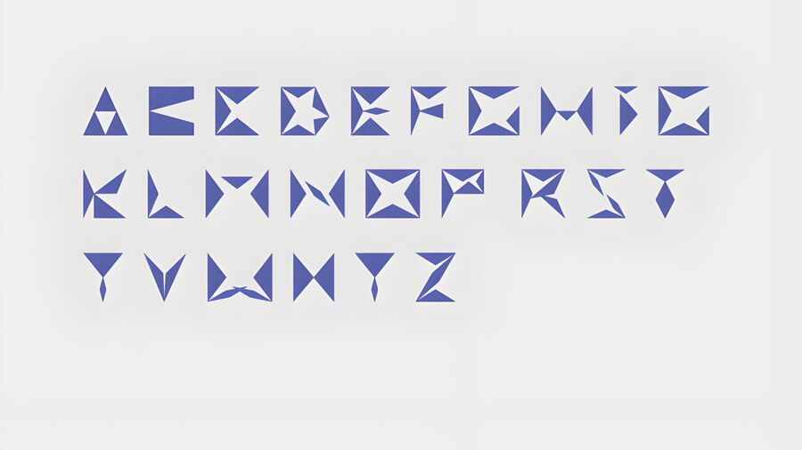
The NOTGEO letters are constructed from triangular elements and their combinations. Crucially, these triangles are not fixed modules; their size, proportion, and placement vary depending on the specific characteristics of each glyph. The interaction between positive and negative space plays a vital role. Inner openings and cutouts become integrated parts of the letter’s overall structure, generating additional geometric forms. Therefore, the typeface’s recognizability stems not from strict standardization of its elements, but from a unified visual principle—the use of triangular geometry, sharp angles, and expressive asymmetry.
FONT
MOCKUPS