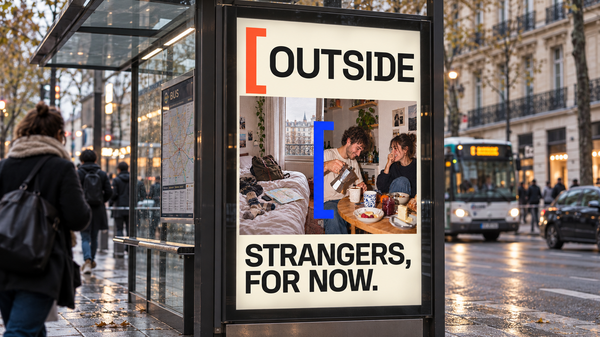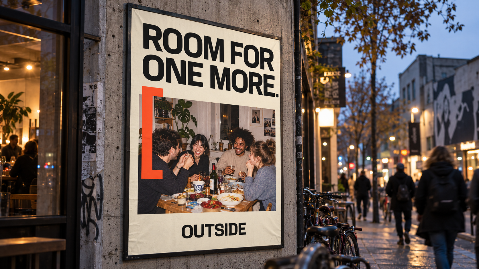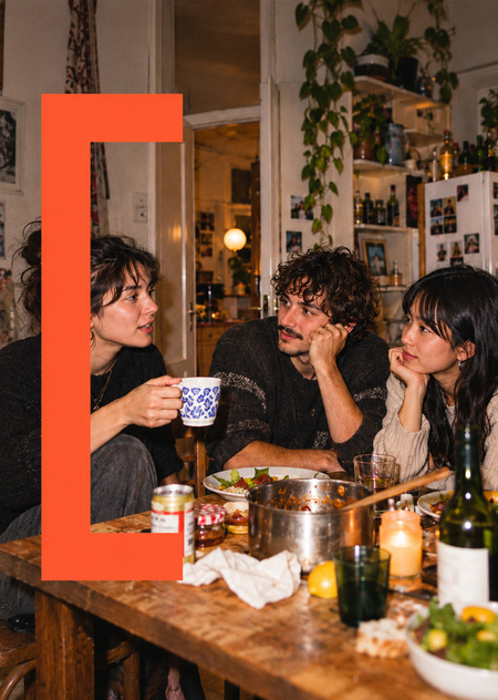
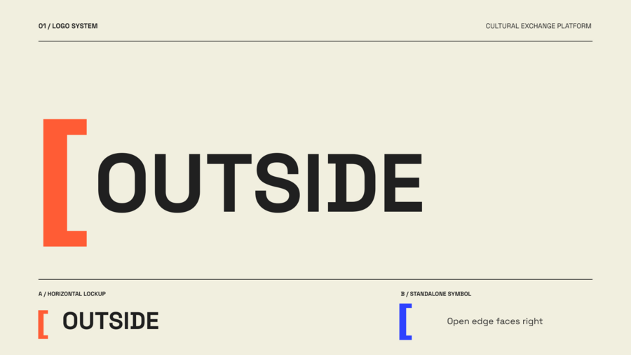
Nooks — a couchsurfing platform geared toward young people. When prompting the artificial intelligence, the focus was placed on the brand identity needing to look vibrant, simple, and recognizable, while also incorporating a visual metaphor. The neural network also suggested an alternative name for the project; the similar platform is now called OUTSIDE.
Main prompt:
Create a high-end, award-winning visual brand identity presentation for OUTSIDE, a bold, youth-oriented couchsurfing and cultural exchange platform. OUTSIDE is not about cheap accommodation or conventional tourism. It is about temporary belonging, unexpected human connections, spontaneous experiences, and crossing the invisible boundary between a stranger and a friend. Develop a distinctive, minimal graphic identity based on the shape of an open bracket—representing an open doorway, an invitation, unfinished journeys, and space for another person. The bracket must become a versatile, recognizable visual system rather than a mere decorative symbol. Integrate it into the logo, typographic compositions, photography framing, posters, mobile interface, merchandise, and editorial layouts.
**Visual direction: ** — Contemporary Swiss graphic design meets experimental youth culture and independent editorial design. — Radical simplicity, bold art direction, distinctive personality. — Oversized, expressive geometric grotesk typography. — Strong, deliberate asymmetrical compositions. — High-impact color blocking, unexpected negative space. — Minimal graphic elements with a coherent visual logic. — Visually striking yet highly functional. — A rebellious, playful, confident, and intelligent aesthetic. — No generic startup appearance.
Brand Identity Prompt:
Color palette: Signal Orange FF5C35, Electric Blue 2E42FF, Warm Paper F1EFDF, Almost Black 202020. Use warm off-white as the breathing space and orange or electric blue as dominant accent colors. Typography: Extra-bold geometric grotesk, inspired by Neue Montreal and Space Grotesk. Compact, confident letterforms. Extreme variations in typographic scale. Minimal functional microtypography for contrast. Photography: Candid, analog-inspired documentary photography of young travelers in authentic apartments around the world. Unposed kitchen conversations, open doorways, messy bedrooms, shared dinners, unexpected friendships, imperfect everyday interiors. Direct flash photography, natural imperfections, intimate yet non-romantic atmosphere.
Prompt for native speakers:
Art Direction: Develop a brand aesthetic that evokes an independent European creative studio designing for a new generation of globally connected travelers. The feel should be sophisticated in its design thinking, meticulously controlled in composition, and unconventional yet approachable. Present this as a cohesive, premium graphic design case study using a clean editorial layout, featuring multiple distinct mockups and a strong visual hierarchy. Avoid: Airplanes, globes, location pins, tourist clichés, juvenile doodles, excessive illustration, gradients, glassmorphism, 3D mascots, random decorative elements, generic corporate branding, and unnecessarily complex iconography. The final result must feel iconic, memorable, youthful, emotionally authentic, and immediately recognizable.