The visual study analyzes the Maison Margiela house identity as an example of communication built upon its very absence.
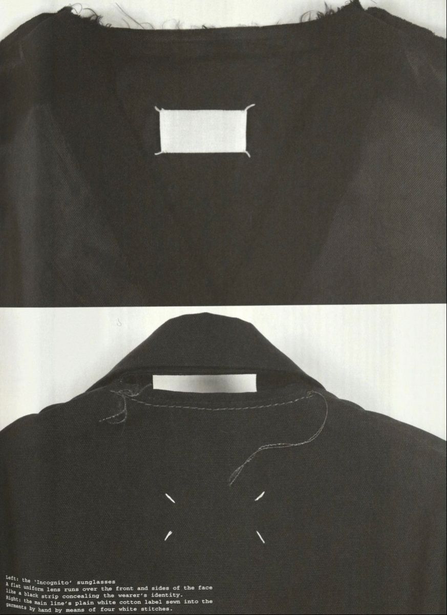
Original blank Maison Martin Margiela label
The House was founded in Paris in 1988 by Belgian designer Martin Margiela, alongside his business partner Jenny Meirens. Margiela graduated from the Royal Academy of Fine Arts in Antwerp and had experience working as an assistant to Jean-Paul Gaultier, giving him an insider’s knowledge of the industry. When launching his brand, he went against the dominant trend of the time. The 1980s and 1990s were an era of logomania—screen printing on leather goods featuring Gucci and Louis Vuitton logos, loud, oversized monograms from houses like Versace and Moschino, the distinctive double «F» monogram of Fendi on bags and apparel. The logo itself became a standalone commodity that consumers were willing to pay a premium for. Martin Margiela stripped all visible branding from his pieces, opting instead for a clean, white tag devoid of any insignia.
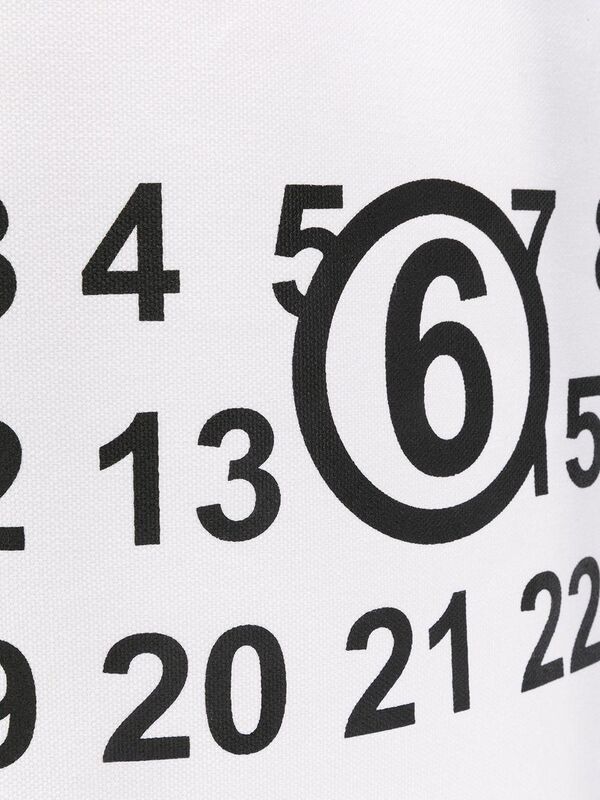
0 1 2 3 4 5 ⑥ 7 8 9 10 11 12 13 14 15 16 17 18 19 20 21 22 23
The tag was attached with four large white stitches over the finished piece, leaving them visible on the outside. In 1997, a grid of numbers from 0 to 23 was added to the blank label, with the required digit circled. The founder himself called this grid the «declaration of anonymity.»
Anonymity became a core principle. Models walked the runway with faces covered by fabric or bodily veils. Atelier and boutique staff wore identical white coats, much like laboratory technicians. Margiela himself avoided giving interviews on camera or showing his face for nearly thirty years; he signed all letters as «Maison Martin Margiela» and spoke of himself in the plural, presenting himself as a workshop without a single author. In 2009, after the founder’s departure, anonymity remained the code of the house, surviving under two successors—John Galliano and Glenn Martens.
Maison Margiela Four-Stitches Bifold Wallet Black
This is where the interest for the psychology of perception emerges. Margiela did not use advertising in the traditional sense; for years, it operated without a face, a name, a logo, or conventional marketing. Yet, the brand grew into one of the most recognizable and copied. The refusal to communicate became its most powerful statement. This also significantly impacted revenue. In 2002, the OTB group acquired a controlling stake in the brand and successfully transformed the concept of anti-marketing into a viable business model.
The research hypothesis is straightforward: the less a brand communicates about itself directly, the higher the status perceived by the consumer. Empty labels, numbers instead of names, and concealed identities function as an «insider» signal—a marker of luxury stronger than any overt emblem. The viewer themselves constructs the value in places where the brand deliberately remains ambiguous.
MAISON MARGIELA Bracelet (Silver)
The work systematically analyzes specific visual solutions and the perception mechanisms upon which they rely. The concluding phase involves verifying the hypothesis and determining whether it requires refinement.
Empty Label and Four Stitches
The first Maison Margiela tag was a rectangle of plain white cotton fabric, completely devoid of any markings. No logo, no name, no composition—just a blank white field. This move seemed provocative in an industry where the brand label itself held inherent value.
/
\
Margela Jenney Mayrens’ business partner explained the logic simply. According to her, a person who sees a strong item in a store without any branding becomes even more curious.
Four prominent white stitches fastened the tag at the corners. The stitches were intentionally placed externally, usually on the back or near the collar, leaving them visible. The design intended for the tag to be easily unravelable, rendering the garment unrecognizable. This distinctive white stitching became the hallmark of the fashion house.
The logo typically functions as a striking element against the fabric, catching the eye with a vibrant mark that lingers in memory. Margiela flips this convention. In a display crammed with logos, the empty white space becomes the most unexpected element—a prominent figure in itself. This triggers the effect of isolation, or the Restorff effect, where the unusual element against a uniform background is remembered more strongly.
The absence of a sign is read as a sign.
Four stitches add a second layer. They evade the casual observer and are recognizable only to those who know the code, thus transforming the mark into an in-group signal. The object remains silent to the crowd but speaks to the initiated. The narrower the circle of those who decode the sign, the more valuable the act of identification itself.
Numbers instead of the name
Until 1997, the label remained completely blank. Then, a grid of numbers from 0 to 23 was printed on it in three rows, and the required digit began to be circled. Most fashion houses have lines with familiar and understandable names, such as mainline, diffusion, or fragrance. Martin Margiela replaced words with numbers.
0 1 2 3 4 5
⑥ 7 8 9 10 11
Zero signifies the artisanal, handcrafted line; one denotes women’s apparel, ten denotes men’s, eleven denotes accessories, and twenty-two denotes footwear. About ten numbers from the full range are currently available.
To understand what you are looking at, you need to know the table.
The verbal name works on its own. The sporting line is instantly recognized, without any preparation. A number means nothing until you learn it. Margela replaced the familiar name with an index that means absolutely nothing to a random person. The word is processed automatically, at the linguistic level, whereas the number requires specific knowledge and a conversion chart. The barrier to entry is raised.
Decoding the code requires a certain level of visual literacy, so the very act of decoding becomes a form of currency. A person who immediately recognizes the circled fourteen as a men’s wardrobe confirms their belonging to a select group. This digital code filters the audience at the entrance, acting as a silent password.
Numbers give a clean, neutral tone. They look like an inventory list or a catalog code—devoid of emotion.