«SLOY» Copy Center
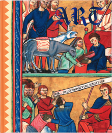
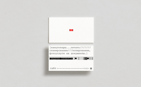
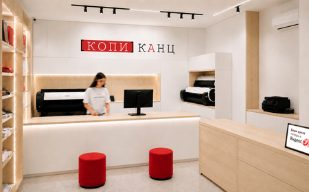
— The concept of a copying center and printing studio, integrating work with paper, printing, material surfaces, and multilayered graphics. Visual language: icy blue, milky, graphite, translucency, fine lines, fluid forms, natural lighting, and grainy texture.Previously, «Kopikants» was the original academic brand identity for the copying center. Its visual system included a red, black, and white palette, typewriter typography, functional statuses, barcodes, packaging, merchandise, facade, and interior design. For the redesign, the decision was made to retain only the scope of activity while completely changing the name and visual concept.
Early Project
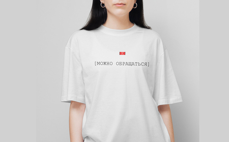
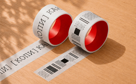
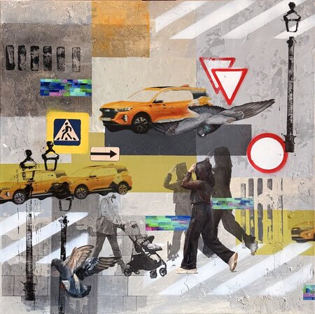
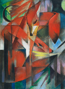
Images from the original project
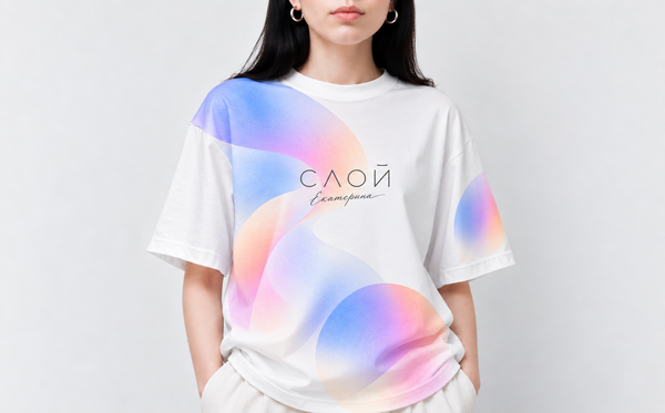
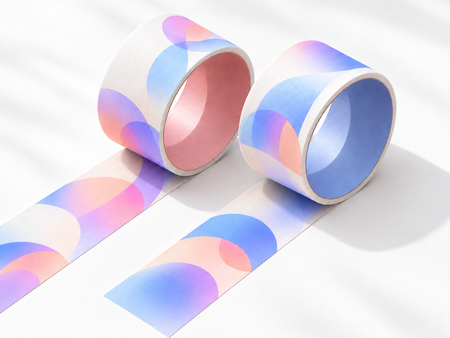
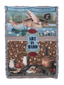
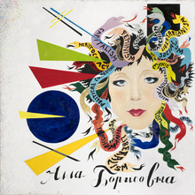
New images for the AI project
Case Study 1
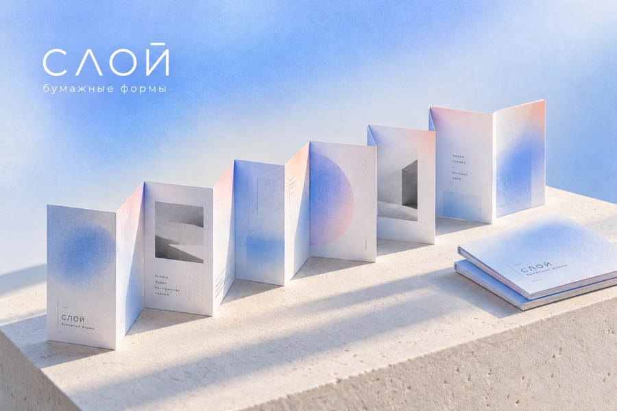
The fold-out brochure explores the architectural potential of paper. The sequence of folds creates rhythm, volume, and motion, transforming a flat sheet into a three-dimensional object.
Space
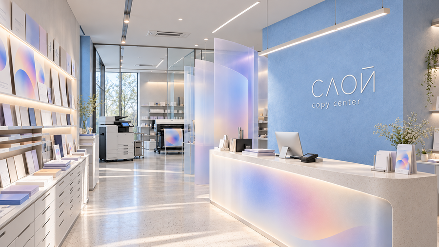
The interior of the copy center merges the functionality of a print studio with the atmosphere of a contemporary design space. Soft lighting, matte surfaces, and translucent partitions carry the brand’s aesthetic into the architecture.
Space
Case Study 2
The Sample Zone allows visitors to explore the diversity of paper—its weight, texture, and color possibilities. The space is organized as a material library, where the selection of paper becomes an integral part of the creative process.
Poster 1
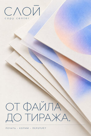
The poster visualizes a sequence of printed sheets unified by a shared graphic. The composition emphasizes the materiality of print and the journey of a digital image toward a finished run.
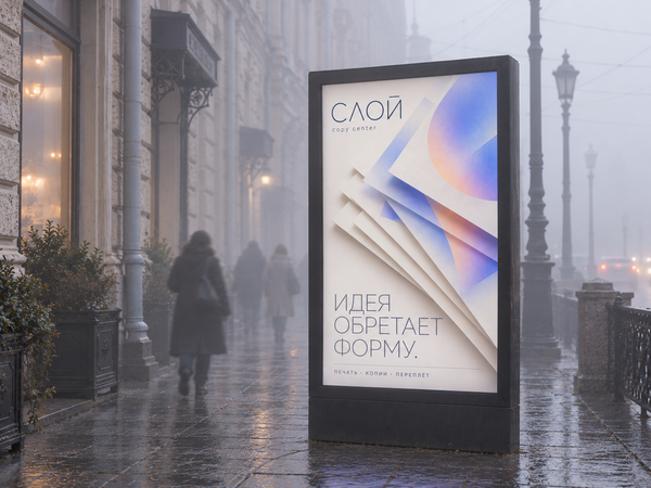
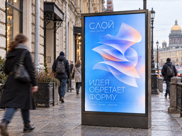
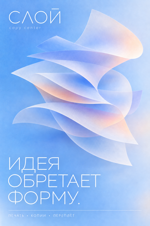
The second poster is based on the transition from an abstract idea to a physical object. Semi-transparent paper planes form a volumetric composition, revealing the brand’s core principle—the interaction of layers.
Poster 2
Advertising installations are integrated into the urban environment of Saint Petersburg. Light, branded imagery provides a visual contrast to the historic architecture while maintaining brand recognition across varying lighting conditions and weather.
Merch 1
A semi-transparent bag is crafted using our signature materials aesthetic. Smooth graphics interact with its matte surface, and the dimensional logo becomes an integral part of the structure itself.
Merch 2
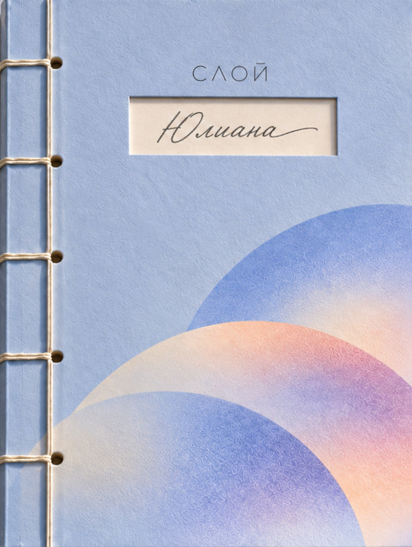
The notebook, bound with Japanese stitching, merges traditional craftsmanship with modern design. A cutout window on the cover allows for personalization by hand-inscribing the owner’s name.
Merch 3
The organizer embodies the concept of layered complexity in object design. Semi-transparent curved dividers create space for paper storage, while elegant writing implements continue the brand’s aesthetic.
Kaywiz 3
The printed image transforms into an independent work of art. The plasticity of the paper and the delicate color transitions showcase the possibilities of contemporary art printing.
Identity
Identity
Case Study 4
«SLOY» exemplifies how a traditional copy center can transform into a contemporary design brand. A unified visual system evolves across print materials, office supplies, spatial design, and urban advertising, all while maintaining a cohesive identity and recognizability.
Case Study 5