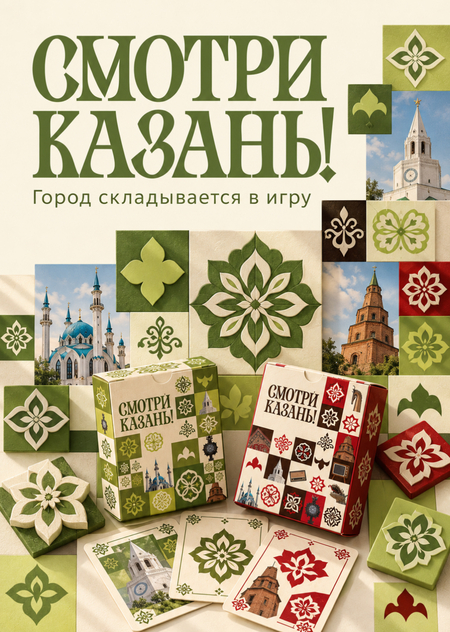
Game Guide: Explore popular and niche routes, complete tasks at various locations, and discover the culture of Kazan.
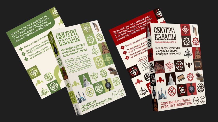
The project features two versions: a family-friendly game and a competitive «Crime of the 90s.»
The City Unfurls as a Game
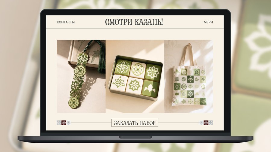
Developing a project into a line of games and souvenirs. Ornaments and city fragments become three-dimensional game modules from which promotional compositions are assembled.
The foundation of the identity is the original logo, custom ornaments, and a square grid. Decorative headings are combined with a simple serif font.
Color Palette: cream, green, lime, red, brown. HEX codes are determined from the original images.
New product presentation
Case Study 1. Billboard
Caywiz 2. Citylight
Keviz 3. Bus
Keyvis 4. Digital Banner
Keyviz 5. Desktop Display
Merchandise
Space
Promotional Materials
Tools Used
- Built-in image generation in ChatGPT—creating visualizations from text prompts and attached images.
https://learn.chatgpt.com/docs/image-generation?utm_source=chatgpt.com
— ImageMagick—preparing the project cover.
https://imagemagick.org/
The images were created using ChatGPT’s built-in generator. The exact model identifier is not specified in the results, so I am providing a link to the official tool documentation:
https://developers.openai.com/api/docs/guides/tools-image-generation?utm_source=chatgpt.com
Workflow
- Reference Preparation
First, I gathered the logo, ornaments, and both packaging designs. For merchandise, I additionally used old visualizations of the shopper tote, bookmark, and cookie.
Specific images were attached to the requests. In the text, I explained the purpose of each item: where to source the logo, where to view the packaging illustration, and which ornament shapes to retain.
- Defining Visual Attributes
The core attributes were repeated in the prompts: the decorative Cyrillic logo, the original ornaments, the square grid, and the two color variations. This established the overall conditions for the series.
- Decomposing the Project into Individual Tasks
Instead of a single request for the entire project, I prepared separate tasks: the product, five key cases, merchandise, environment, posters, and cover art.
For each image, the object, composition, material, lighting, typography, and constraints were specified. For instance, for the packaging, it was specified separately that only the front face of the box die-cut should be placed on the front panel.
- Creating Five Independent Case Studies
The composition varied for each carrier: — Billboard—a horizontal path of modules. — Citylight—a stepped composition moving upwards. — Bus—a stretched stripe along the body. — Digital Banner—a compact cluster of elements around the box. — Tabletop Display—two paths leading to different game versions.
The product, ornaments, palette, and the concept of volumetric game elements remained consistent across all pieces.
- Translating Graphics onto Materials
In the requests for merchandise, cotton, metal, enamel, glaze, and ceramic were described separately. For the spatial design, the materials included painted plywood, wood, and cardboard packaging. This allowed us to demonstrate how a single graphic system could look across various objects, rather than simply repeating the same print.
- Using a Final Image as a New Reference
After creating the object visualizations for the boxes, they were used as an additional reference for the cover and the mug. They established a consistent mood regarding lighting, textures, and the overall character of the product photography.
- Image Review and Preparation
After generation, the key texts, the presence of necessary objects, the recognizability of the patterns, and the coherence between the images were reviewed. For horizontal images, the requests specified a 16:9 format. The cover was initially rendered at 1060 × 1484 pixels, then scaled and slightly cropped to 1140 × 1600 using ImageMagick. The mug became the fourth piece of merchandise and served as an additional display screen.