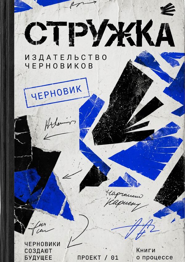
Struzhka is a publishing house that gathers and prints the drafts of artists. The main product of the publishing house is books featuring a unique selection of photographic and textual materials that demonstrate the importance of the creative process.
Redesign
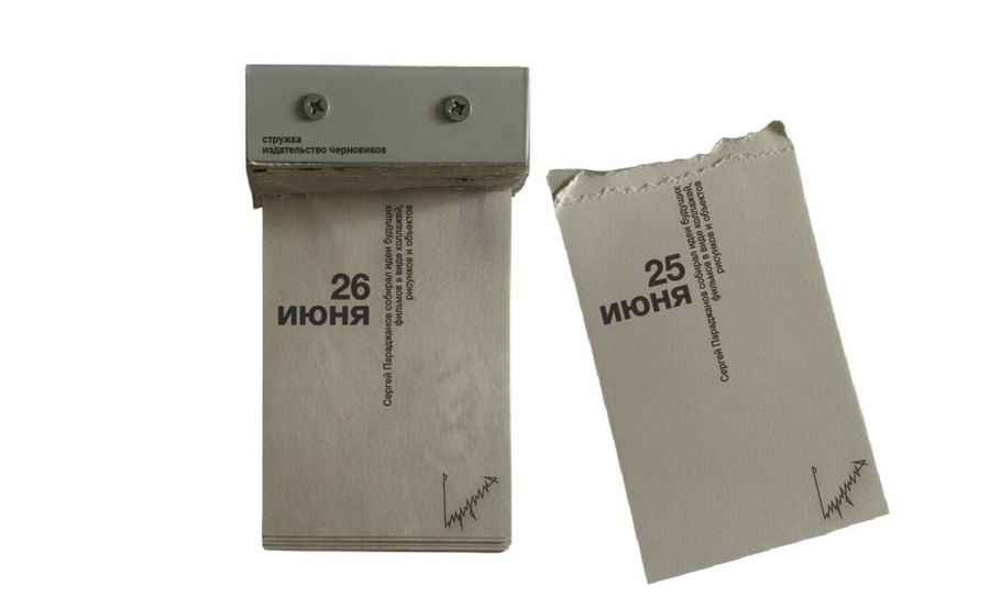
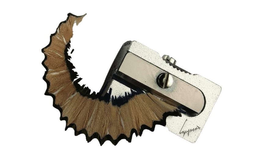
concept exploration: In the older version of «Struzhki, ” the primary focus was on authorship. With the redesign, I wanted to bring the creative process—the act of making art—into the visual presentation and make it the core of the visual concept.
Prompt: Study the «Shchipka» project—a publishing house for the drafts of artists. Propose several directions for redesign while preserving the core concept: the value of the creative process and the publication of unfinished works. Find metaphors that can be interestingly explored through graphic design, materials, and objects. Do not limit yourself to the conventional aesthetics of a book publisher. For each option, describe the concept, the visual language, and potential brand development opportunities.
Of the options proposed, I settled on the metaphor of the «Unfinished Factory.» I liked the idea of presenting the publishing house as a place where creative chaos transforms into a book, yet still retains the traces of the process itself—corrections, annotations, sketches, and random finds.
Identity
Prompt: Create an outdoor advertisement for the «Struzhka» publishing house—specifically for the series «The Factory of Unfinished» (Фабрика незавершённого)—set in an urban environment: on a building facade, a street, a bus stop, or in the subway.
Use the brand identity: cobalt blue, black, white, and gray; paper textures, printing smudges, torn edges, editorial markings, serial numbers, and the symbol of diverging stripes. Convey the idea of transforming creative chaos into a book through collages, manuscripts, and layers of paper.
Combine strict geometry with experimental typography and controlled chaos. Ensure realistic architecture, perspective, lighting, and scale. The composition should be wide-format, focusing heavily on the advertisement, avoiding extraneous details, random logos, and illegible text. Leave space for subsequent text revisions.
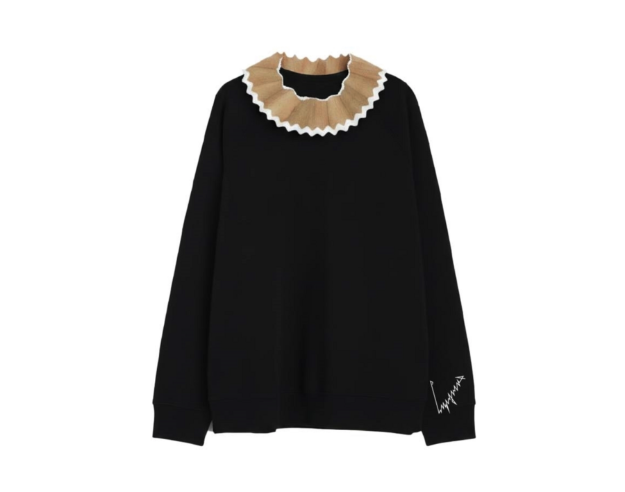
prompt: Use the uploaded image as a reference for the «STRUZHKA» publishing identity—"Factory of Unfinished Works.» Create a series of high-quality product photographs for merchandise: a fabric shopper, a t-shirt, a notebook, and stationery. Each item must be shown individually, close-up, and whole, with no overlaps, shot in a professional studio setting.Maintain the signature color palette: cobalt blue, black, white, and gray. Incorporate the original logo and the radiating stripe symbol, printing texture, correction marks, and serial numbering. Place the graphics on the items realistically, as if done with actual silkscreen printing or embossing. Materials must look natural and detailed: dense cotton, textured paper, matte surfaces.Minimalist composition, neutral light gray background, soft natural shadows, high detail, realistic proportions, and the aesthetic of a contemporary independent publishing house. Each item should function as a standalone commercial case study, suitable for brand presentation. Do not combine items into a still life, do not crop the edges of the objects, and do not add extraneous logos or random text. Preserve the visual integrity of the original identity.
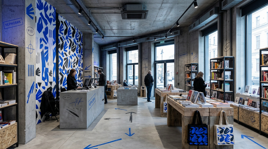
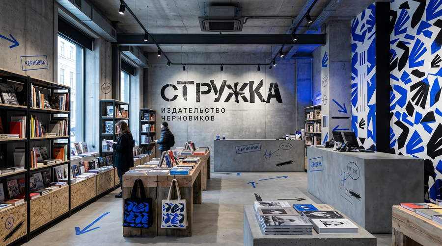
prompt: Create a photorealistic visualization of the interior of the publisher’s store «STRUZHKA» — «The Factory of Unfinished Things.» The space should blend contemporary industrial architecture, the aesthetic of a printing workshop, and that of an independent bookstore. Utilize concrete walls and ceilings, large windows, metal shelving, massive wooden tables, and exposed structural elements.Integrate the brand identity: cobalt blue, black, white, and gray; a large pattern of diverging stripes, proofreading marks, technical annotations, serial numbers, and graphic arrows. Place manuscript books on tables and shelves, and add paper archives, folders, test prints, and branded tote bags. Use graphics on the walls, furniture, and navigation while maintaining a unified brand visual language.