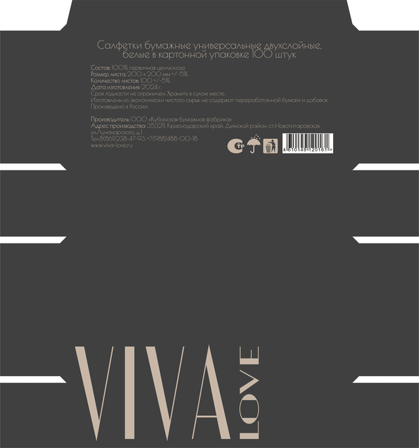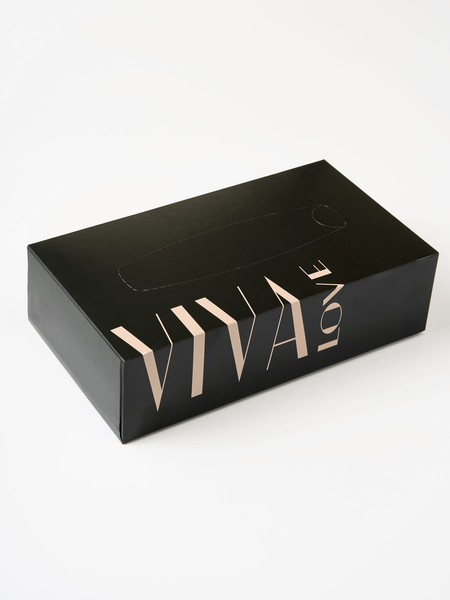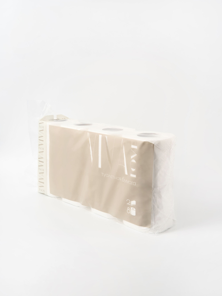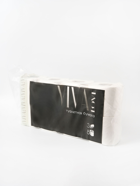
«VIVA LOVE» paper package

Rebranding, which made everyday beautiful, is the story of VIVA LOVE.
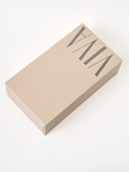
How often do we notice what we use every day? Paperwork is a familiar, almost invisible part of the household. But it is she who creates a sense of comfort, comfort and purity. The VIVA LOVE brand reminded us that simple things also deserve respect for shape and taste.

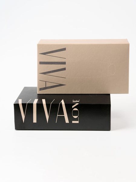
Rebranding from ASTROM was a rethinking of the usual. The new brand style is based on a contrast between light and dark — a visual dialogue of gentleness and strictness. There’s nothing random about design, except clean lines, calm colors, and sure printing. A logo, a map of fonts and flowers, a model for the website and a printing press have been created. The entire visual system brings together a line of paper products under a single, recognizable way — modern, minimalistic, and expressive.
